8.1 The Grammar of Graphics
A graph begins with data, and the data we work with will be tidy data that comes in a data frame. Leland Wilkinson’s Grammar of Graphics (see (Wilkinson 2005)) posits that most quantitative graphics constructed from a data frame can be understood in terms of a few basic elements. In our quite elementary introduction to the Grammar, the elements to which we will pay the most attention are as follows:
- Glyphs: the basic units of a graph. Glyphs represent cases in the data frame. Each glyph corresponds to one or more cases, but no two glyphs correspond to the same case.
- Aesthetics: perceptual properties of glyphs that are not the same for all glyphs but instead vary depending on the values of variables for the case (or cases) that each glyph represents.
- Frame: special aesthetics that relate the position of each glyphs in the graph to values of variables for the cases that the glyph represents.
- Scales: particular choices that determine the precise relationship between aesthetic properties and data values for glyphs.
- Guides: visual aids that help the human viewer to infer data values for cases from the aesthetic properties of the glyphs that represent them.
We will clarify these abstract ideas with a series of examples. Many of our examples will be drawn from the m111survey data frame in the tigerstats package.
library(bcscr)
help(m111survey)
You will recall that the data frame records the results of a survey of 71 students at Georgetown College in Kentucky. Each case (row in the frame) corresponds to an individual student. See Table 8.1.
| sex | fastest | GPA | seat | weight_feel |
|---|---|---|---|---|
| male | 119 | 3.56 | 1_front | 1_underweight |
| male | 110 | 2.50 | 2_middle | 2_about_right |
| female | 85 | 3.80 | 2_middle | 2_about_right |
| female | 100 | 3.50 | 1_front | 1_underweight |
| male | 95 | 3.20 | 3_back | 1_underweight |
| male | 100 | 3.10 | 1_front | 3_overweight |
8.1.1 Example: a Scatterplot
We begin with a simple scatter plot based on the data. A scatter plot is often a good way to investigate graphically the relationship between two numerical variables. Figure 8.1 shows a scatter plot of student GPA vs. the fastest speed at which the student has ever driven a car.
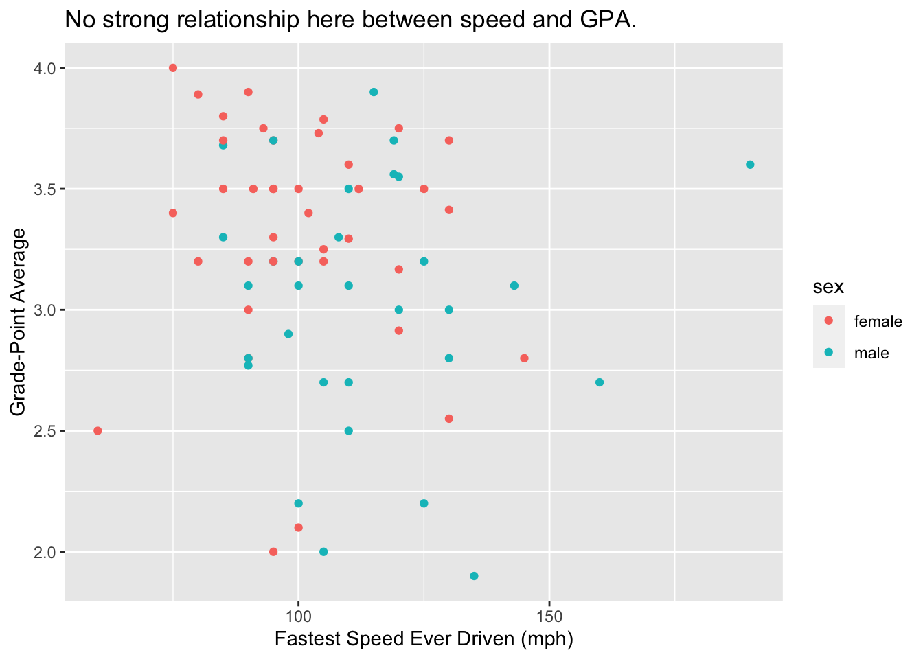
Figure 8.1: Scatterplot of fastest driving speed and GPA. Points are colored by sex of the student.
8.1.1.1 The Glyphs
In this scatter plot, the glyphs are points. Each case—each student in the survey—is represented by one and only one point on the plot.
8.1.1.2 The Aesthetics
In ordinary discourse the term aesthetic refers to any perceptual property of an object. For a point, the list of its perceptual properties includes its location, its shape, its size, its color, and so on. In the Grammar of Graphics, however, only some of the properties—the one that vary from glyph to glyph depending on data—count as aesthetics in the graph.
For the scatter plot, the property of size is not considered to be an aesthetic: we can see that this is so because all of the points are the same size, and so the size cannot vary with the values of some variable in the data frame. The same goes for the property of shape: all of the points in this scatter plot are circular.
On the other hand, the property of color IS an aesthetic for the glyphs in the graph, since the males and the females in the study are represented by points of different colors. You could say that color is mapped to the variable sex in the data frame:
- the reddish color goes with the value “female”;
- the turquoise color goes with the value “male.”
8.1.1.3 The Frame
In our scatter plot there are two other glyph properties that count as aesthetics:
- x-location: the position of the glyph relative to the horizontal axis of the graph;
- y-location: the position of the glyph relative to the vertical axis.
We can see that these properties are aesthetics because:
- x-location is mapped to the variable
fastest: the further to the right the glyph is, the greater is the value offastestfor the student represented by that glyph. - y-location is mapped to the variable
GPA: the higher up the glyph is, the greater is the value ofGPAfor the student represented by that glyph.
Although x and y locations are just two more aesthetics, they are so crucial to the nature of a two-dimensional graph that they are classed separately in the Grammar of Graphics as the frame for the graph.
In the graphs we consider in this Chapter, the frame will always consist of at least the x-location, and sometimes—as in the case of our scatter plot—the y-location as well.
8.1.1.4 Scales
We can decide that color (for example) is to be mapped to sex, but that decision leaves open the question of how, precisely, to make the connection. The computer can make thousands of colors: which one will correspond to the value “male,” and which to “female?” To answer that question is to choose a scale.
In this example our scale was:
- reddish = female
- turquoise = male
But we might have adopted a different scale, such as:
- blue = female
- pink = male
Every aesthetic mapping involves a choice of a scale. Consider x-location: apparently a point on the extreme left of the scatter plot represent a student who drove 50 miles per hour. A point at the extreme right corresponds to a speed of 200 miles per hour, and in general the relationship between x-location and fastest is linear: for example, a point halfway across the graph goes with a speed of 125 miles per hour, halfway between 50 mph and 200 mph. In the same way, the mapping of y-location to GPA involves a linear choice of scale.
8.1.1.5 Guides
How were we able to see what the scales were for each of the three aesthetic mappings in the scatter plot? We were assisted by three set of guides, one for each mapping:
- the legend to the right of the plot guided us from color to value of
sex; - the labels and tick marks on the x-axis and the thin vertical white lines guided us from x-location to value of
fastest; - the labels and tick marks on the y-axis and the thin horizontal white lines guided us from y-location to value of
GPA.
Most of the time, every aesthetic mapping is accompanied by a guide that gives the human viewer at least a rough idea of the scale chosen for that mapping.
8.1.1.6 Summary
In summary we say that for this scatter plot:
- The glyphs are points.
- This time each glyph represents one and only one case.
- The frame is:
- x =
fastest - y =
GPA
- x =
- Other aesthetics are:
- color =
sex
- color =
- There are scales for the three aesthetic mappings above. (But we usually don’t say much about the x and y-location scales if they are linear, and we don’t make a big deal of the color scale unless we went to some trouble to choose it ourselves.)
- The legend and the axis labels, tick marks and hash-lines are the guides.
8.1.2 Example: Two Bar Graphs
Bar graphs are useful in the study of categorical variables, especially factor variables that have only a few possible values. Figure 8.2 shows the distribution of the factor variable seat in the mat111survey data frame.
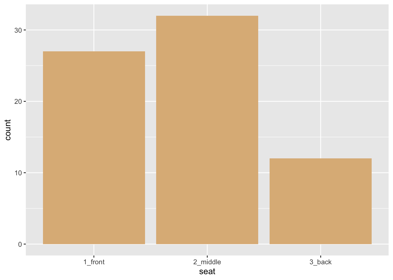
Figure 8.2: Bar graph of seating preference. The bars have a burlywood fill.
In this graph:
- The glyphs are bars.
- This time each glyph an entire group of cases: there is a bar for the students who prefer the front, a bar for the students who prefer the middle, and a bar for the back-sitters.
- The frame is:
- x =
seat. Note that it is possible for x-location to map to a categorical variable! - In this graph the y-location does not count as part of the frame, since it is not really an aesthetic. Instead the height of a bar along the y-axis tells us how many students are represented by that bar. In the Grammar of Graphics we say that the y-axis represents a statistic—a value computed from the data. In the situation at hand, our statistic is a simple tally of the cases for each value of
seat.
- x =
- There are no other aesthetics! The glyphs have various perceptual properties such as a shape rectangular and color, but these don’t vary with the cases: the shape is always rectangular and the color is always burlywood.
- There is a scale for the x-location, but there is nothing very interesting about it: the three values of
seatare equally spaced along the axis. - There is a guide for the x-location: labels on the x-axis tell us which bar goes with which value of the variable
seat.
Bar graphs can also be used to study the relationship between two categorical variables. Figure 8.3 shows the relationship between sex and seating preference in the m111survey data.
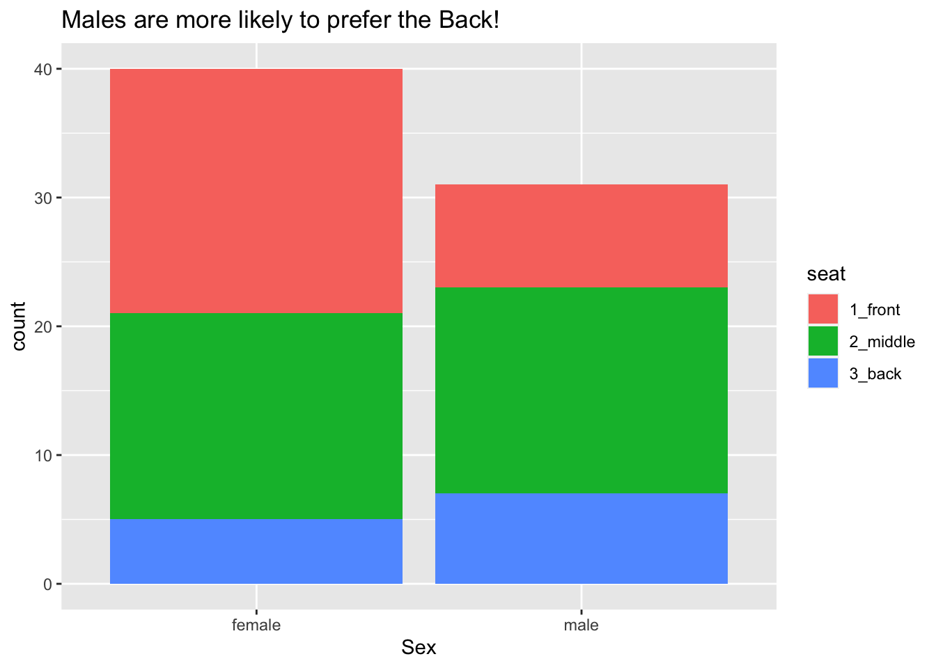
Figure 8.3: Seating preference, by sex.
Again the glyphs are bars and each bar represents many cases, but now there is a bar for each combination of the values of sex and seat. The frame is again specified only by the x-location, but this time it is mapped to sex. There is another aesthetic as well: the color (more technically, the fill) of the bars is mapped to the variable seat, allowing us to see the relationship between the two categorical variables sex and seat. Scales and guides work much the same way as in the previous example.
8.1.3 Examples: Histograms, Density Plots and Box Plots
In this section we’ll examine some glyphs that are useful in the visualization of numerical variables.
8.1.3.1 Histograms
How are the fastest speeds driven distributed, for students in the m111survey data? In order to investigate such a question graphically, we might make a histogram like the one in Figure 8.4.
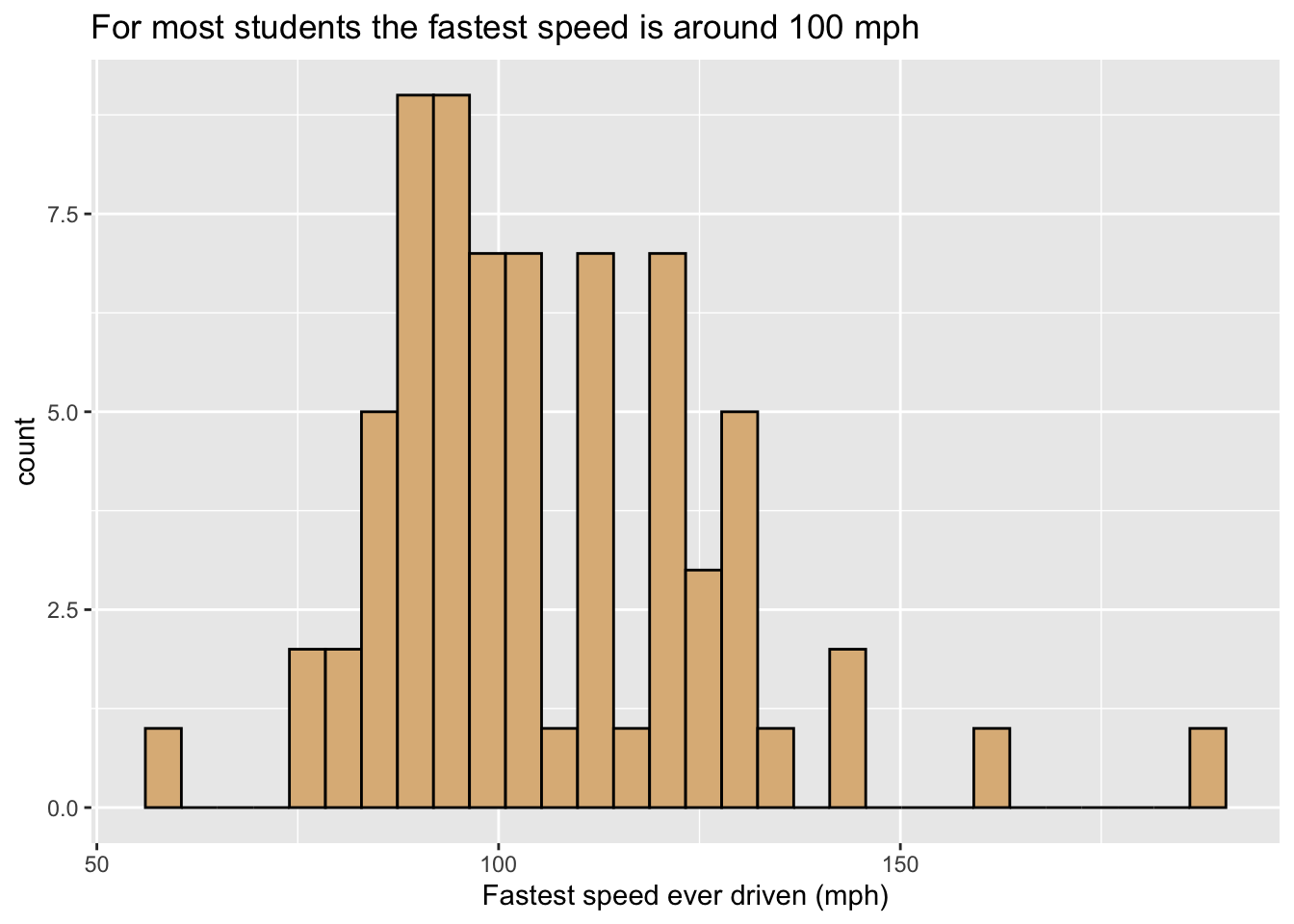
Figure 8.4: Histogram of the fastest speed ever driven.
In this graph:
- The glyphs are rectangles. Each rectangle represents cases where the value of
fastestlies within a particular range covered by the bottom left and right corners of the rectangle. - The frame is:
- x =
fastest. - As with our bar graphs, the y-location does not count as part of the frame, but instead represents a statistic, permitting the height of a rectangle to indicate the number of cases that it represents.
- x =
- Again there are no other aesthetics. The burlywood fill of the rectangles is constant.
- The scale for x-location, maps location to
fastestin the familiar linear fashion, and the x-axis has the usual guides found for numerical variables.
Figure 8.5 is a variant, containing a second type of glyph: each student is now represented along the X-axis by a rug-tick located approximately at his or her fastest speed. (The ticks are actually “jittered” randomly so as to avoid over-plotting when two or more students report the same speed.) The addition of a second set of glyphs is called layerng, and is a common device to enhance the communicative power of a graph.
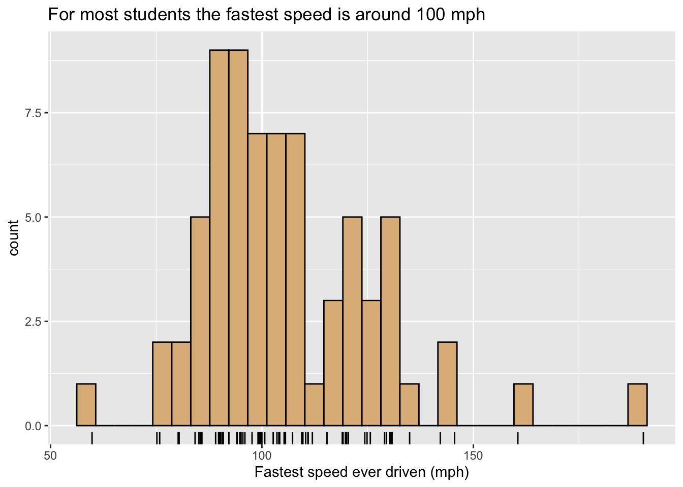
Figure 8.5: Histogram of the fastest speed ever driven.
8.1.3.2 Density Plots
One may also study the distribution of numerical variable with a density plot, as in Figure 8.6. In this figure there is only one glyph, the curve itself, and it represents all of the cases. However, its height represents crowding (density) of values of fastest for the cases: when the curve is high, many values are crowded closely together on the x-axis, and for speeds where the curve is low the viewer knows that few (if any) students drive around that speed. The y-axis is again used along with a statistic: for density plots the vertical scale is chosen in such a way that the total area under the density curve is 1, so that the area under the curve between two given speeds is approximately equal to the proportion of students who had speeds within that range. For density plots a rug, provided again by slightly jittered ticks, is a useful additional layer to indicate crowding of values.
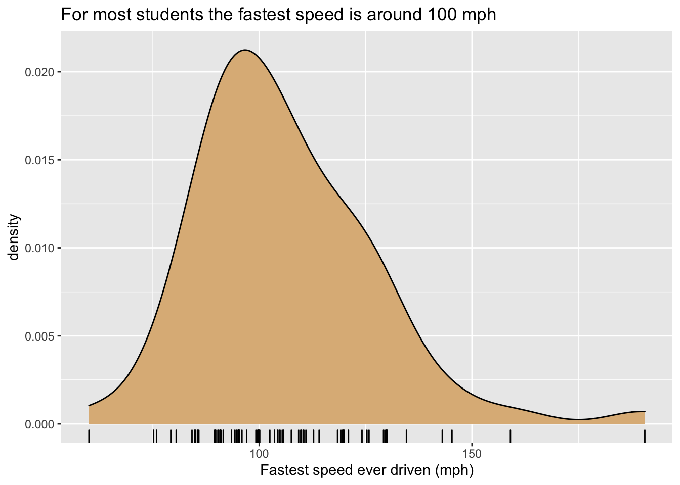
Figure 8.6: Density plot of the fastest speed ever driven.
Since they don’t take up much territory on a graph, density curves are especially useful when we want to study the relationship between a numerical and a categorical variable. For example, Figure 8.7 shows density plots of the fastest speeds for each of the three possible seating preferences. The glyphs are again density curves, but since the color aesthetic has been mapped to seat, we get a separate and differently-colored glyphs, one for each seating-preference..
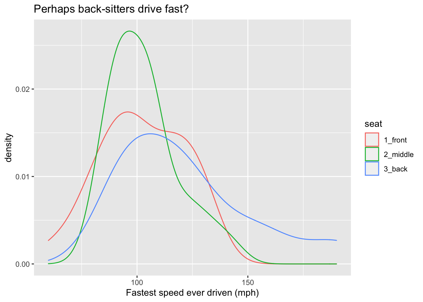
Figure 8.7: Density plot of the fastest speed ever driven.
Another approach to the same graphing problem is to use a type of glyph known as a violin. Look at Figure 8.8.
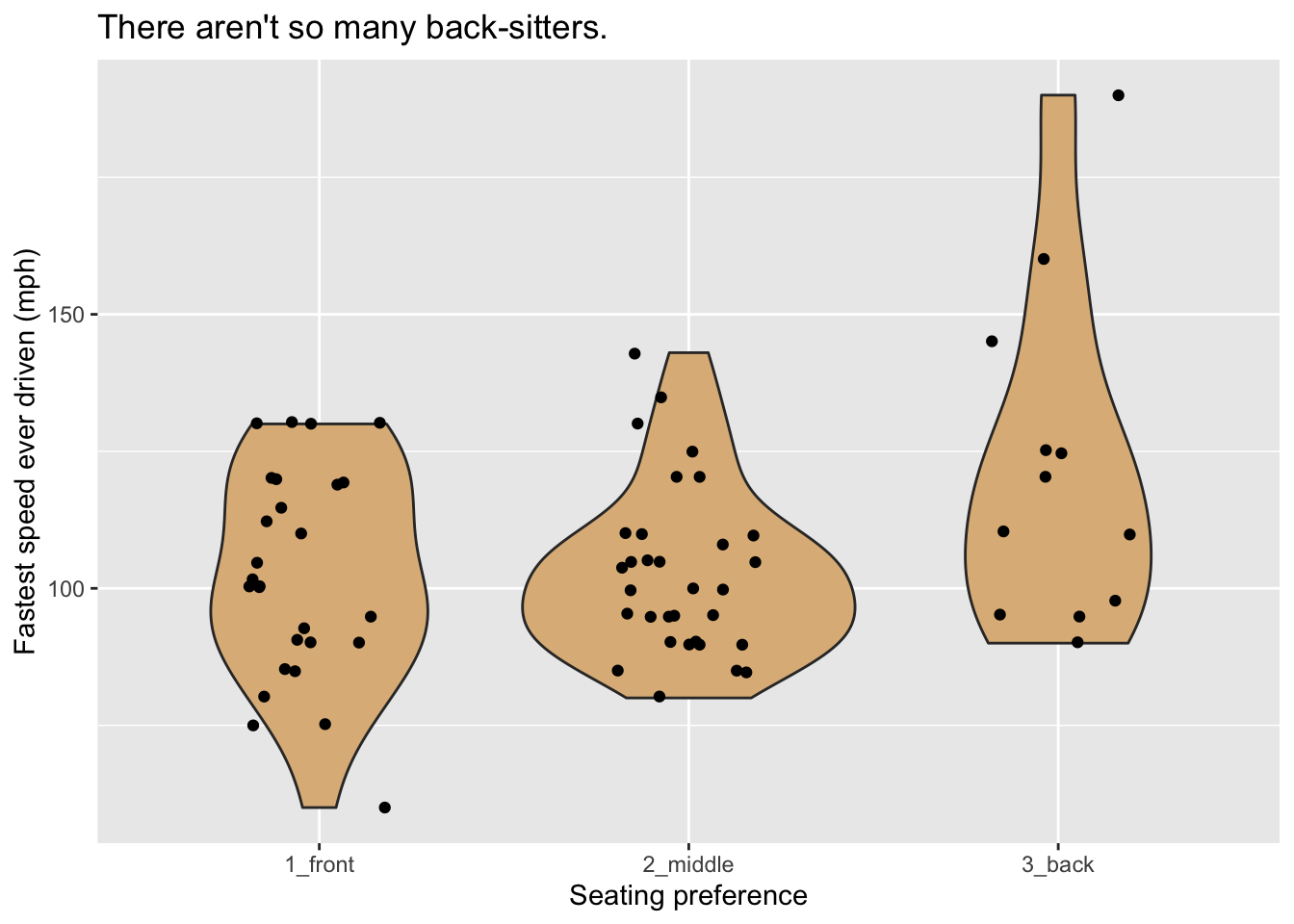
Figure 8.8: Violin plot of the fastest speed ever driven.
A violin glyph is simply two mirror-images of the same density plot, pasted together along their bases. Thus the violin is thick where many values are clustered together and thin where data values are rare. In this plot, the frame is constituted by mapping x-location to seat and y-location to the variable fastest. For additional communicative power we have layered another set of glyphs–jittered points, one for each case–onto the plot.
Suppose that one wished to incorporate a third variable, such as sex, into the graph? One possible way to to this is to divide the graphs into separate plots based on the values of one of the categorical variables in question. The separate plots are known as facets, and are illustrated in Figure 8.9, where facet-ing has been done on the basis of the variable seat.
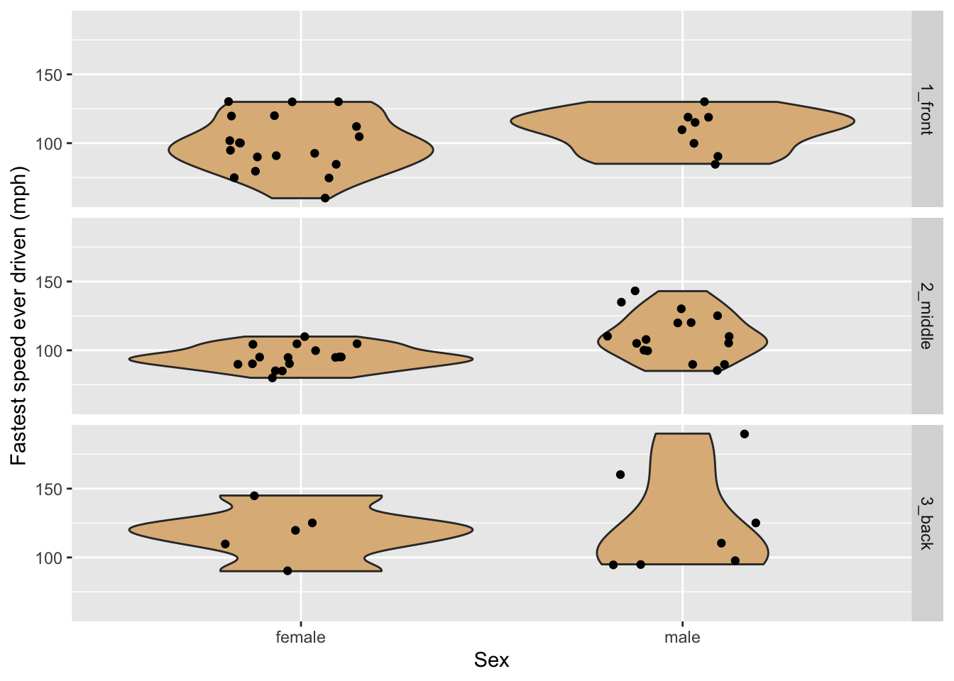
Figure 8.9: Violin plots of the fastest speed ever driven, by sex and seating preference.
8.1.3.3 Box Plots
The five number summary is a convenient way to summarize the distribution of a numerical variable. The five numbers involved are:
- the minimum value
- the first quartile \(Q1\), the \(25^{\text{th}}\) percentile of the values
- the median, which is the \(50^{\text{th}}\) percentile
- the third quartile \(Q3\), the \(75^{\text{th}}\) percentile
- the maximum value
Also of interest is the interquartile range \(IQR\), defined as:
\[IQR = Q3 - Q1.\]
The interquartile range covers measures the spread in the middle 50% of the values.
In R the five number summary can be got quickly with the fivenum() function:
fnFastest <- fivenum(m111survey$fastest)
names(fnFastest) <- c("min", "Q1", "median", "Q3", "max")
fnFastest
## min Q1 median Q3 max
## 60.0 90.5 102.0 119.5 190.0A box-plot glyph is the graphical counterpart of the five number summary. Figure 8.10 shows how it works for the variable fastest in the m111survey data frame. The box ranges from \(Q1\) to \(Q3\), covering the middle half of the speeds. The lower hinge extends from \(Q1\) down to the minimum speed. The upper hinge would have extended from \(Q3\) to the maximum value, but the maximum value was flagged as an outlier. When ggplot2 makes a box-plot, any point that is
- greater than \(Q3 + 1.5 \times IQR\) or
- less than \(Q1 - 1.5 \times IQR\)
is flagged for individual plotting, and the corresponding hinge will be \(1.5 \times IQR\) units long.
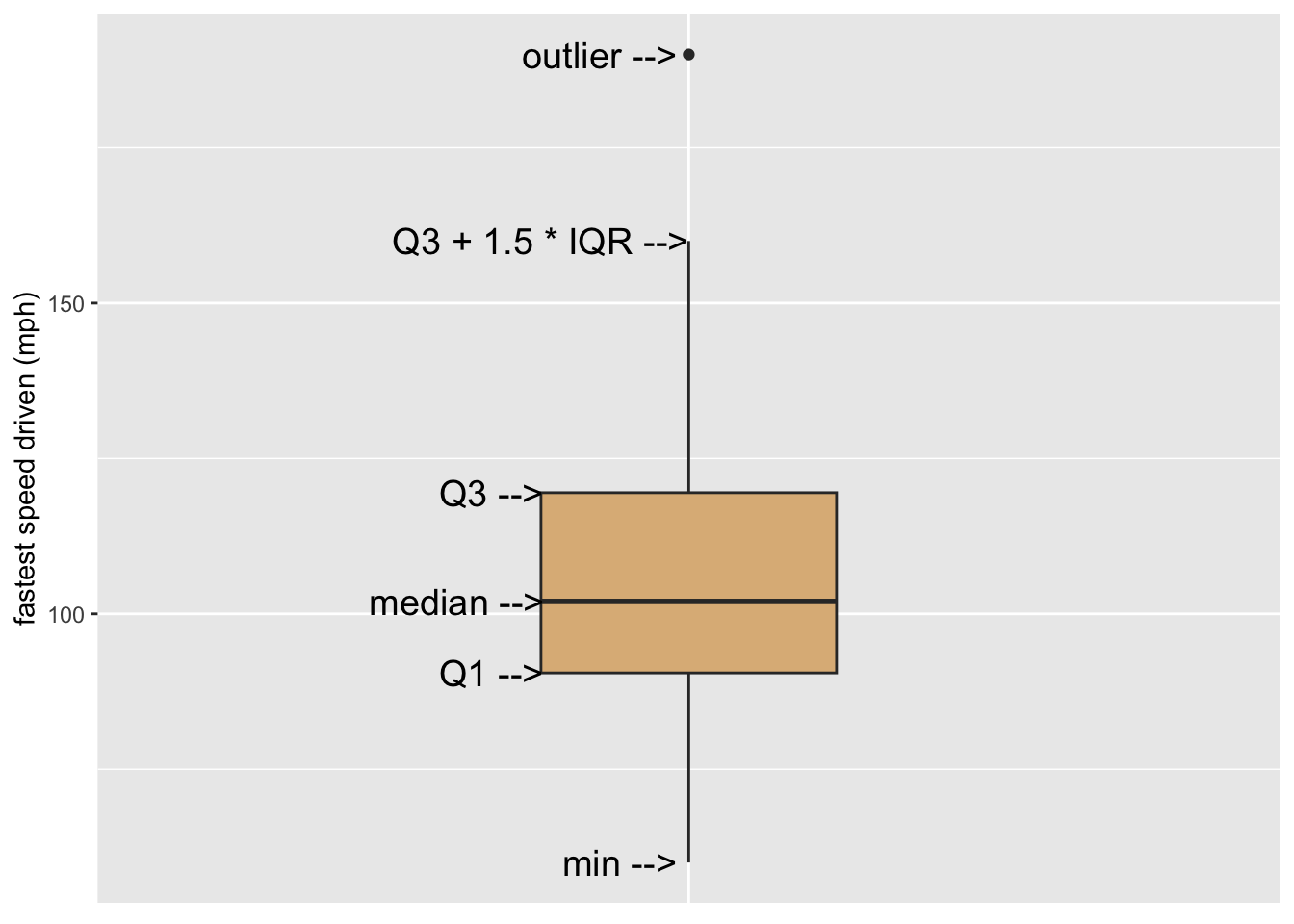
Figure 8.10: Illustration of a simple box plot.
A single box glyph on its own is not very interesting. Where box plots shine is in the study of the relationship between a numerical variable and a categorical with a large number of levels, as in Figure 8.11. Here the glyphs are boxes, with each box being constructed from the bills that were issued in a particular month.
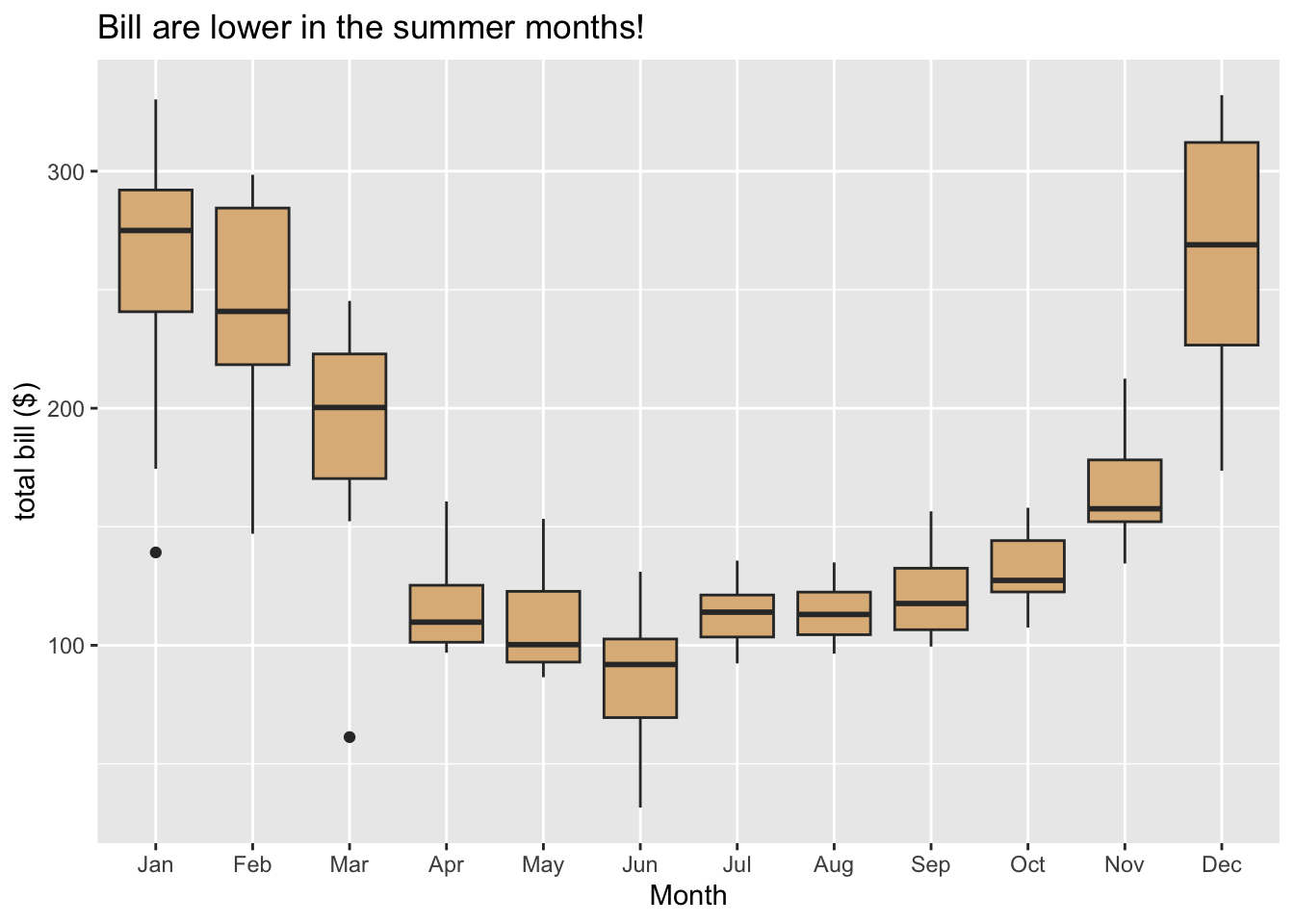
Figure 8.11: Utility bills through the year.
8.1.4 Example: Choropleth Maps
The term “choropleth” derives from Greek and means “many regions.” A choropleth graph is a graph in which the frame is provided by some sort of map with regions that might be countries, cities or counties in the U.S. etc.
In the choropleth map shown in Figure 8.12, is based on a data frame in which ease case is a state in the U.S (along with the District of Columbia). One of the variables is population, the population of the state. The glyphs are the territories of each of the U.S. states. The frame is determined by mapping x and y-location to latitude and longitude. The aesthetic property color is mapped to the population, and a guide is provided to the right of the graph.
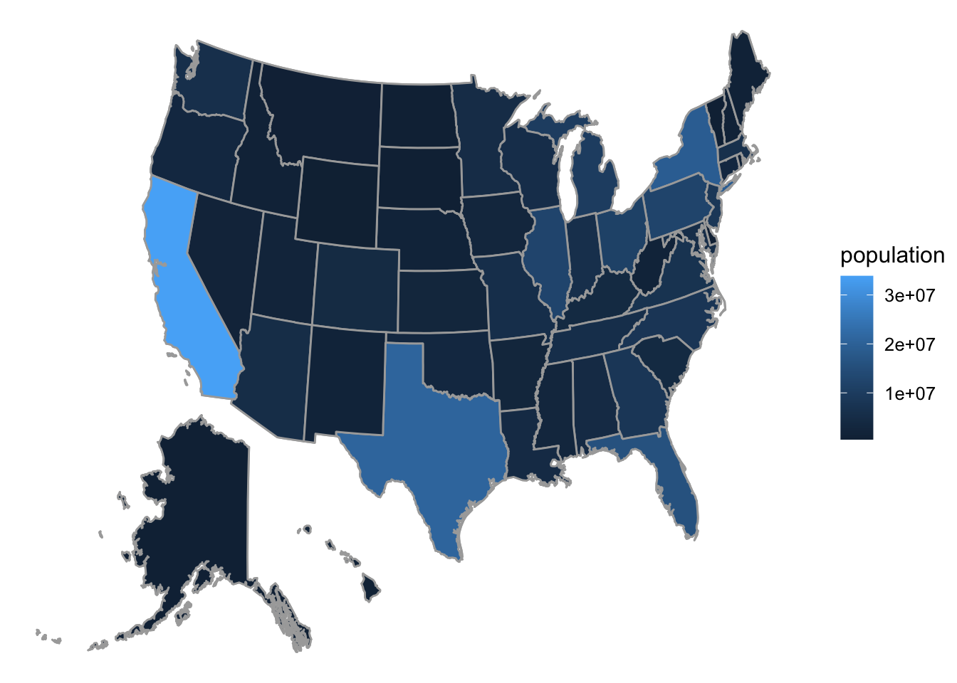
Figure 8.12: Choropleth map of state populations in the U.S.
8.1.5 Practice Exercises
In each of the exercises below, consult the Help for the relevant data frame. (You’ll need to identify variables by their names in the data frame when you discuss aesthetic mappings.)
The following graph is based on the data frame
mosaicData::SwimRecords:
- What variables are used to make the frame?
- What are the two types of glyphs?
- What other aesthetic(s) are there (besides the x and y-locations in the frame)? To what variable(s) are they mapped?
- What guides do you see?
The following graph is based on the data frame
mosaicData::KidsFeet:
- What variable(s) are used to make the frame?
- What are the two types of glyphs?
- What other aesthetic(s) are there (besides the frame)? To what variable(s) are they mapped?
- What guides do you see?
The following graph is based on the data frame
mosaicData::Galton: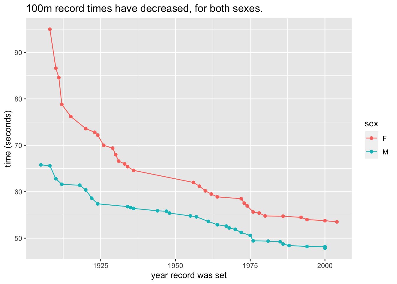
- What variable(s) are used to make the frame?
- What are the two types of glyphs?
- What other aesthetic(s) are there (besides the frame)? To what variable(s) are they mapped?
- What guides do you see?
8.1.6 Solutions to Practice Exercises
Answers:
- Frame: x ->
year, y ->time; - Glyphs: points and line-segments between pairs of points;
- Other aesthetics: point-color and line-color are both mapped to
sex; - Guides: legend for
sex, axis labels and ticks foryearandtime.
- Frame: x ->
Answers:
- Frame: x ->
biggerfoot; - Glyphs: bars;
- Other aesthetics: bar fill ->
sex; - Guides: legend for
sex, axis labels and ticks forbiggerfoot.
- Frame: x ->
Answers:
- Frame: x ->
father; - Glyphs: density curve, jittered rug-ticks;
- Other aesthetics: none;
- Guides: axis labels and ticks for
father.
- Frame: x ->