8.4 Factor Variables in Plotting
It is worthwhile to reconsider factor variables (see 7.4.3) and to consider their role in the appearance of plots. We’ll do this by way of an example.
Consider the data frame firesetting in the tigerData package:
data("firesetting", package = "tigerData")
?tigerData::firesetting
As we see from the Help file, fire-setting offers information about a large sample of high-school students. Some of them are known to be arsonists, while of course most are not. The purpose for gathering the data was to determine what characteristics of a child might be risk factors in whether he/she would develop into a fire-setter. Among the variables of interest are:
race, the ethnicity of the student, a factor with three levels: “white,” “black,” and “other”;school.attitude, a scaled score on a personality inventory in which high scores indicate a poor attitude toward school;fires, a factor variable with levels “0” (does not set fires) and “1” (sets fires).
We might study the relationship between these variables with some box-plots via the code below. The results appear as Figure 8.33.
ggplot(firesetting, aes(x = race, y = school.attitude)) +
  geom_boxplot(fill = "burlywood",
               outlier.alpha = 0) +
  geom_jitter(width = 0.20, size = 0.1) +
  facet_wrap(~ fires, nrow = 2) +
  labs(x = "Ethnicity",
       y = "School-Attitude Score")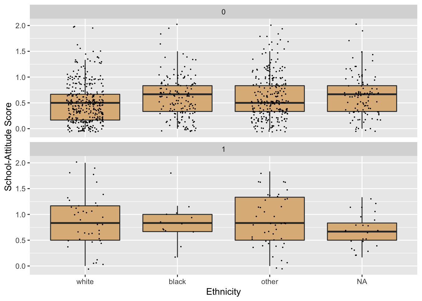
Figure 8.33: Boxplots with jittered individual values. School attitudes are generally worse among fire-setters.
We could improve the appearance of the plot with respect to two of the variables involved:
fires: We should display values that are more meaningful to a human viewer than 0 and 1.race: Let’s change the names of the values somewhat, keeping their current order along the x-axis.
For fires, we simply need to map the current values onto others that we prefer. Currently the levels are:
levels(firesetting$fires)## [1] "0" "1"We can re-map as follows:
betterFires <- plyr::mapvalues(firesetting$fires, from = c("0", "1"),
                         to = c("no fires", "sets fires"))
firesetting$betterFires <- betterFires
For race, we’d like to substitute
- “White” for “white”;
- “AfrAm” for “black”
- “Other” for “other”
- “Unknown” instead of
NA
We’d like the order along the horizontal axis to remain as it is.
We might begin by replacing the NA-values with “Unknown,” as follows:
tempRace <- firesetting$race
tempRace[is.na(tempRace)] <- "Unknown"
We get an error! That’s because race is a factor with only three “possible values,” as given by its levels:
levels(tempRace)## [1] "white" "black" "other"“Unknown” is not considered a “possible value” for tempRace, any attempt to set that value in any elements of tempRace will be resisted.
We can overcome this resistance by coercing tempRace into a mere character-vector:
tempRace <- as.character(tempRace)Now tempRace doesn’t come with a limit on its “possible values.” We try again:
tempRace[is.na(tempRace)] <- "Unknown"This apparently worked. Let’s check:
unique(tempRace)## [1] "white" "other" "Unknown" "black"So far, so good. Now let’s re-map the other three values:
tempRace2 <- plyr::mapvalues(tempRace,
                        from = c("white", "black", "other"),
                        to = c("White", "AfrAm", "Other"))
Let’s check that it worked:
unique(tempRace2)## [1] "White" "Other" "Unknown" "AfrAm"Great. Now let’s add tempRace2 as a new variable into firsetting. In that data frame, it will be called betterRace. Here’s the code to do this:
firesetting$betterRace <- tempRace2Let’s try the graph again. We will need to modify the code a bit, so that we’re using the new and improved variable betterRace, as well as the new variable betterFires. Figure 8.34 is the result.
ggplot(firesetting, aes(x = betterRace, y = school.attitude)) +
  geom_boxplot(fill = "burlywood",
               outlier.alpha = 0) +
  geom_jitter(width = 0.20, size = 0.1) +
  facet_wrap(~ betterFires, nrow = 2) +
  labs(x = "Ethnicity",
       y = "School-Attitude Score")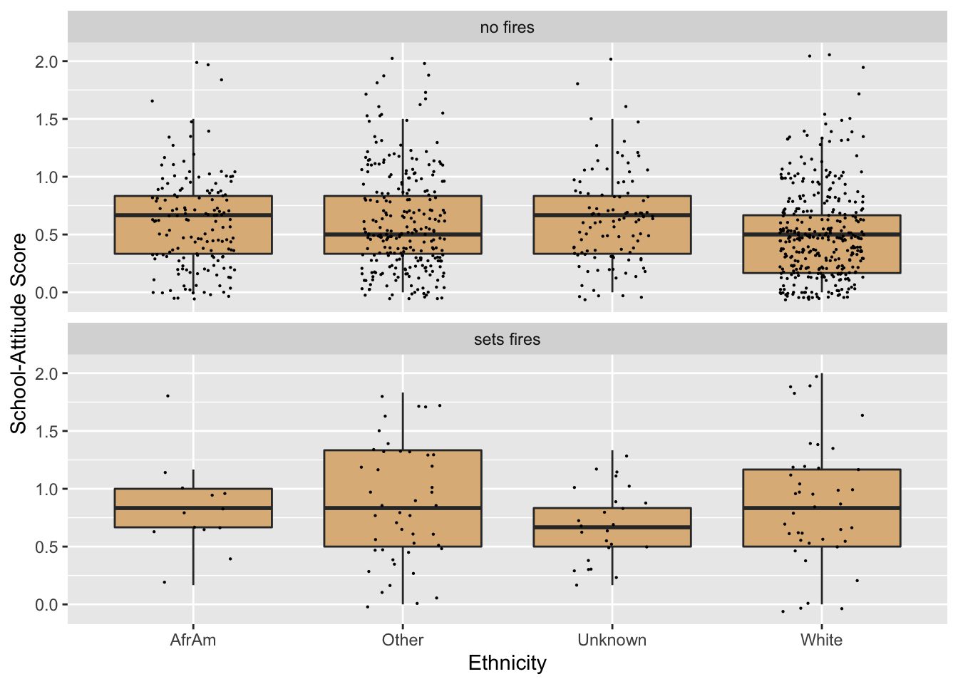
Figure 8.34: We have re-mapped the fires and race variables.
This looks better, but now the order along the x-axis isn’t as we desired. Recall that race is now a character vector only. Since it doesn’t have levels that specify a particular order, ggplot2 uses alphabetical order as the default ordering along the x-axis.
Accordingly we should convert betterRace to a factor variable, and be careful to set the levels in the order that we want:
tempRace <- firesetting$betterRace
betterRace2 <- factor(tempRace,
               levels = c("White", "AfrAm", "Other", "Unknown"))
firesetting$evenBetterRace <- betterRace2
Now try again. Note that in the code below we switch to evenBetterRace. See Figure 8.35 for the result.
ggplot(firesetting, aes(x = evenBetterRace, y = school.attitude)) +
  geom_boxplot(fill = "burlywood",
               outlier.alpha = 0) +
  geom_jitter(width = 0.20, size = 0.1) +
  facet_wrap(~ betterFires, nrow = 2) +
  labs(x = "Ethnicity",
       y = "School-Attitude Score")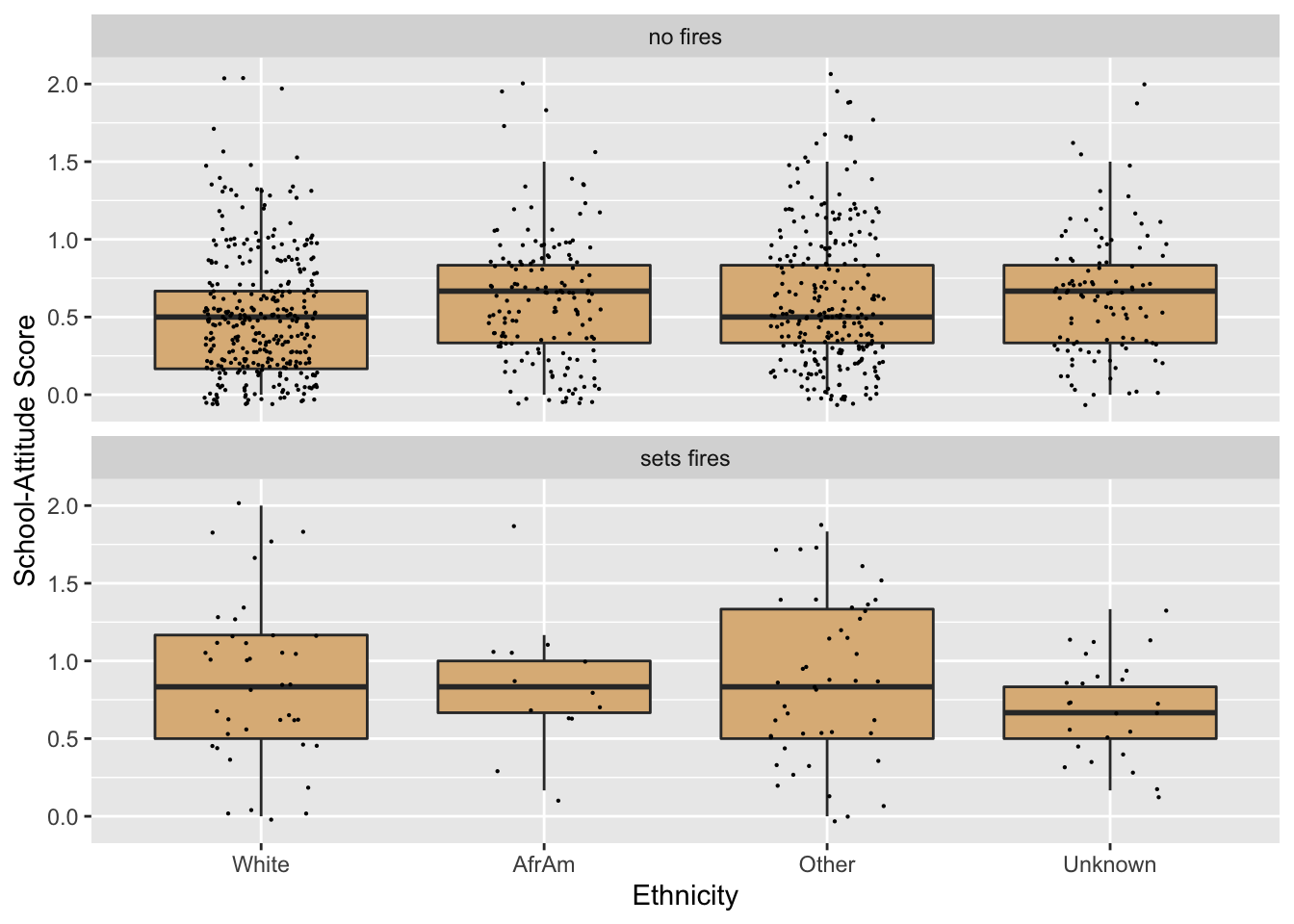
Figure 8.35: Now the order of the race-values is correct!
This works!
8.4.1 Practice Exercises
With
mosaicData::KidsFeet, make the following graph. (Hint: Useplyr::mapvalues().)
With
mosaicData::TenMileRace, make the following graph. (Hint: Usecut()to make age groups. The fill for the boxes is the ever-popular"burlywood".)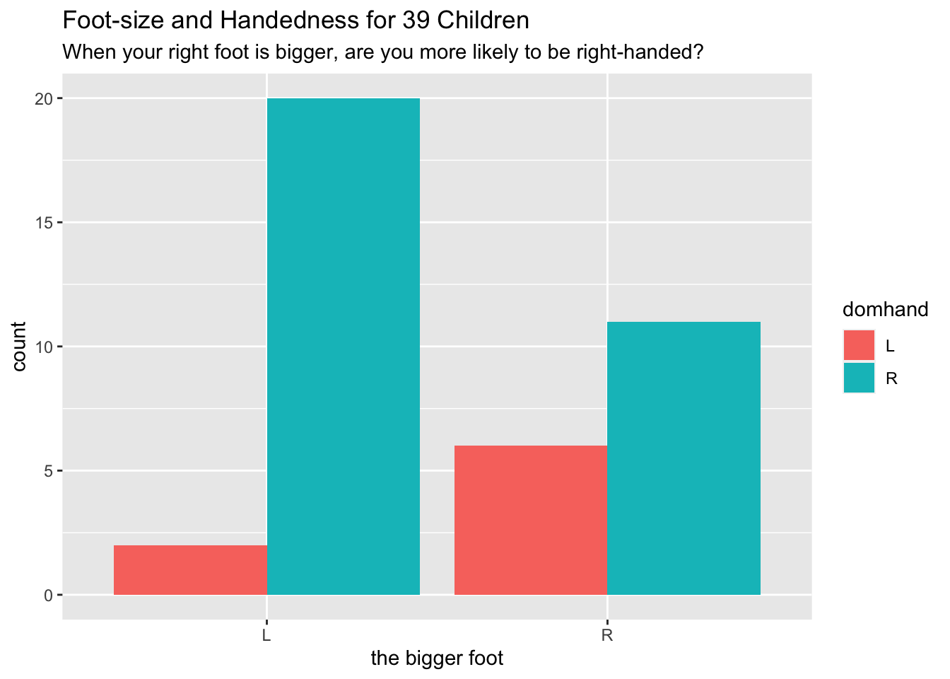
With
mosaicData::Gestation, make the following graph. (Hint: Use!is.na()to select the rows ofGestationwheresmokeis notNA. Then useplyr::mapvalues()onsmoke.)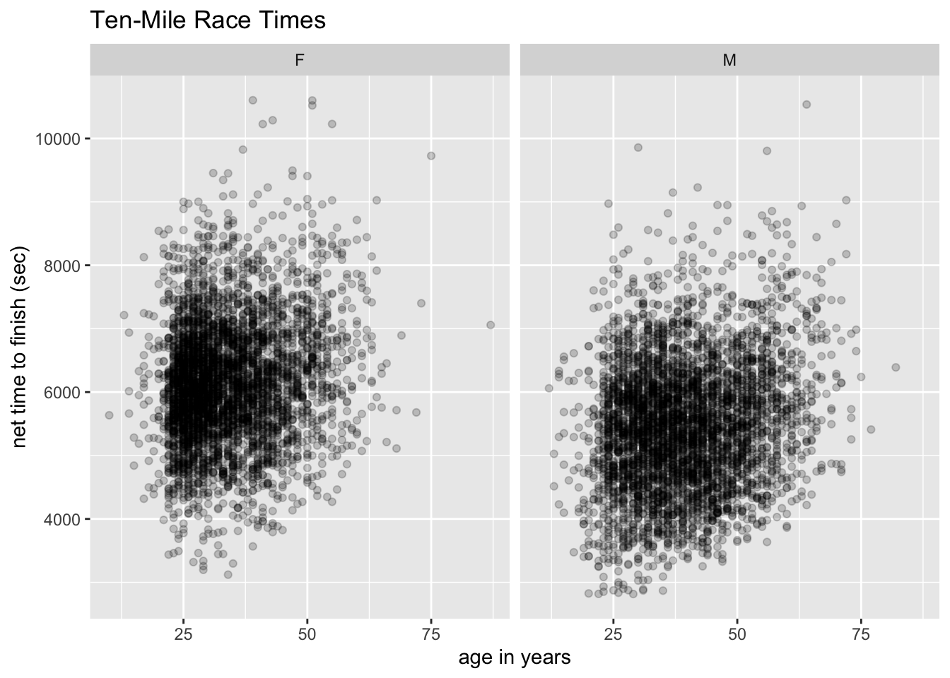
8.4.2 Solutions to Practice Exercises
Here’s the code:
data("KidsFeet", package = "mosaicData")
tempBiggerfoot <- KidsFeet$biggerfoot
biggerfoot2 <- plyr::mapvalues(tempBiggerfoot, c("L", "R"),
                     to = c("left foot", "right foot"))
KidsFeet$betterBiggerfoot <- biggerfoot2
tempDomhand <- KidsFeet$domhand
domhand2 <- plyr::mapvalues(tempDomhand, from = c("L", "R"),
                     to = c("left hand", "right hand"))
KidsFeet$betterDomhand <- domhand2
ggplot(KidsFeet, aes(x = betterBiggerfoot)) +
  geom_bar(aes(fill = betterDomhand), position = "dodge") +
  labs(x = "the bigger foot",
       title = "Foot-size and Handedness for 39 Children",
       subtitle = paste0("When your right foot is bigger, ",
                         "are you more likely to be right-handed?"))
Here’s the code:
data("TenMileRace", package = "mosaicData")
tempSex <- TenMileRace$sex
sex2 <- plyr::mapvalues(tempSex, from = c("F", "M"),
                       to = c("female", "male"))
TenMileRace$betterSex <- sex2
ageGroup <- cut(TenMileRace$age,
                breaks = c(-Inf, 20, 30, 40, 50, 60, 70, Inf),
                labels = c("<20", "20s", "30s", "40s",
                           "50s", "60s", "70+"))
TenMileRace$ageGroup <- ageGroup
ggplot(TenMileRace, aes(x = ageGroup, y = time)) +
  geom_boxplot(fill = "burlywood") +
  facet_grid(betterSex ~ .) +
  labs(x = "Age Group", y = "net time to finish (sec)",
       title = "Ten-Mile Race Times")
Here’s the code:
data("Gestation", package = "mosaicData")
Gestation <- subset(Gestation, !is.na(smoke))
tempSmoke <- Gestation$smoke
smoke2 <- plyr::mapvalues(tempSmoke, from = 0:3,
                         to = c("never", "smokes now",
                                "until curr. preg.",
                                "once smoked"))
Gestation$betterSmoke <- smoke2
ggplot(Gestation, aes(x = factor(betterSmoke), y = wt)) +
  geom_boxplot(fill = "burlywood") +
  labs(x = "smoking status of mother",
       y = "birth weight (ounces)",
       title = "Birth Weights",
       subtitle = "Children of smoking mothers have lower birth-weights.")