8.3 A Case Study: US Births
In Section 1.2.5, we made a plot of the number of births in the United States for each day of that year (see Figure 8.30). We noticed that there appear to be two clouds of points. What accounts for this phenomenon? By now we have the R-programming chops to take on this question.
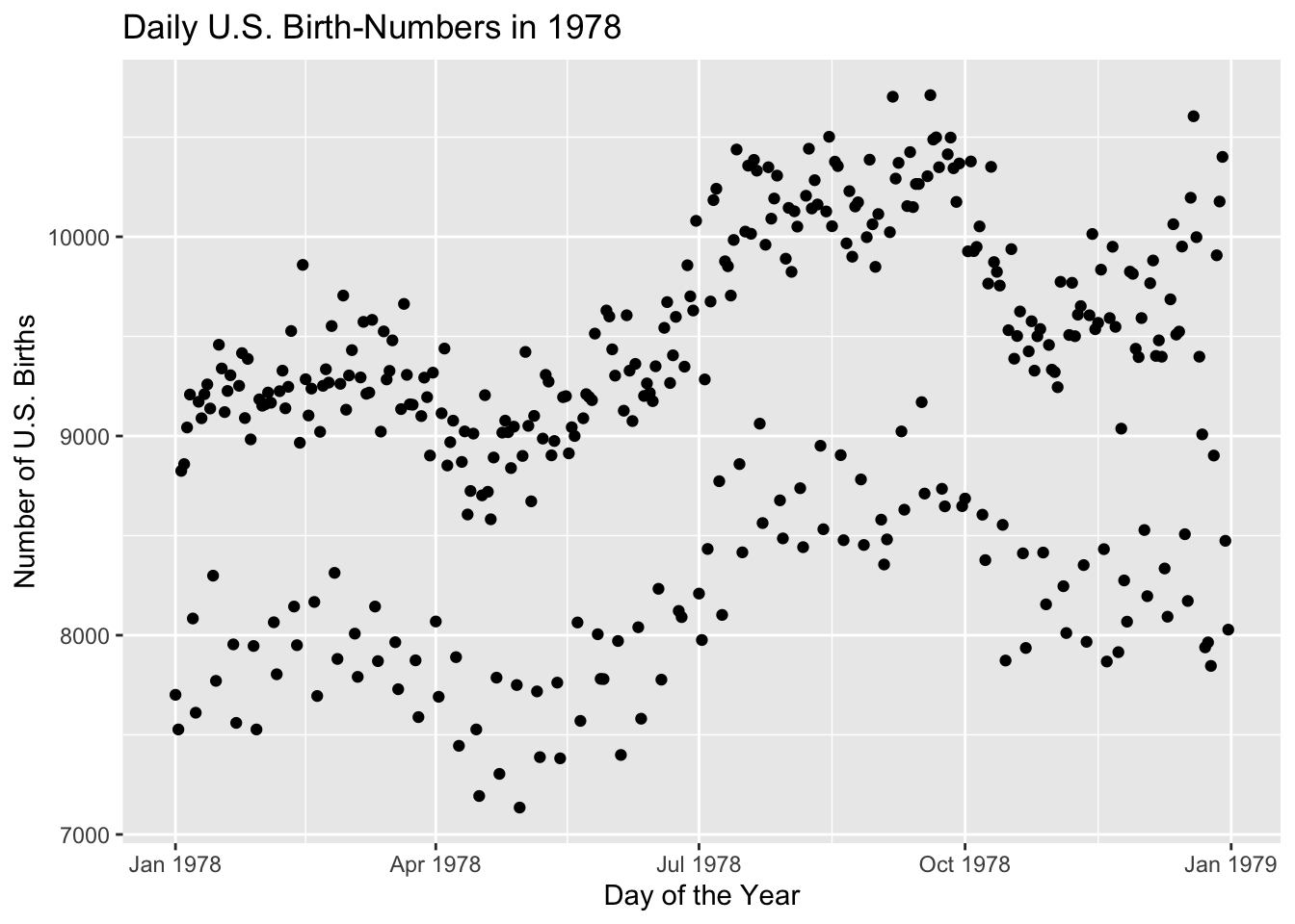
Figure 8.30: Some of the days have significantly fewer births. What’s going on?
To begin with, look at all of the variables available in the data frame Births78:
str(Births78)## 'data.frame': 365 obs. of 8 variables:
## $ date : Date, format: "1978-01-01" "1978-01-02" ...
## $ births : int 7701 7527 8825 8859 9043 9208 8084 7611 9172 9089 ...
## $ wday : Ord.factor w/ 7 levels "Sun"<"Mon"<"Tue"<..: 1 2 3 4 5 6 7 1 2 3 ...
## $ year : num 1978 1978 1978 1978 1978 ...
## $ month : num 1 1 1 1 1 1 1 1 1 1 ...
## $ day_of_year : int 1 2 3 4 5 6 7 8 9 10 ...
## $ day_of_month: int 1 2 3 4 5 6 7 8 9 10 ...
## $ day_of_week : num 1 2 3 4 5 6 7 1 2 3 ...We see that the variable wday gives the name of the day of the week, for each of the days in the year. On a hunch, we make violin plots of the births for each of the days of the week. The code appears below, and the resulting plot is shown in Figure 8.31
ggplot(Births78, aes(x = wday, y = births)) + geom_violin(fill = "burlywood") +
  geom_jitter()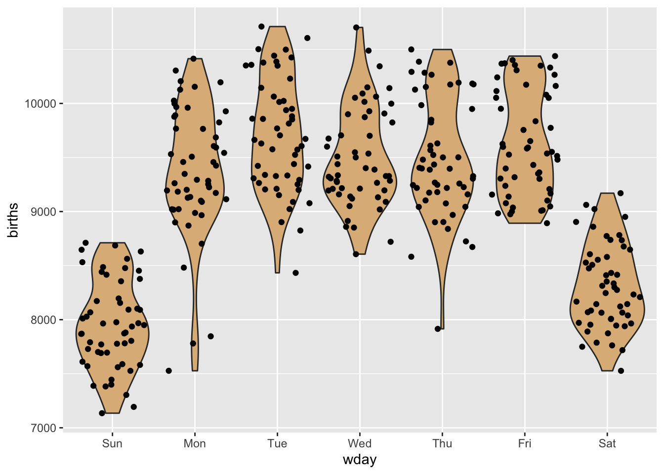
Figure 8.31: Violin plot of births, by day of the week.
Aha! There are considerably fewer births on the weekend-days—Saturday and Sunday. Perhaps the entire lower cloud of points is composed of weekends. Let’s check this by re-coding the days according to whether or not they are during the week or at the weekend:
weekend <- with(Births78, ifelse(wday %in% c("Sat","Sun"),
                                 "weekend", "weekday"))
Births78$weekend <- weekend
Note that we have added the new variable to the data frame, so that it will be easy in ggplot2 to use that variable for grouping, as in the code below. The results appear in Figure 8.32.
ggplot(Births78, aes(x = date, y = births)) + geom_point(aes(color = weekend)) +
  labs(x = "Day of the Year", y = "Number of U.S. Births",
       title = "Daily U.S. Birth-Numbers in 1978")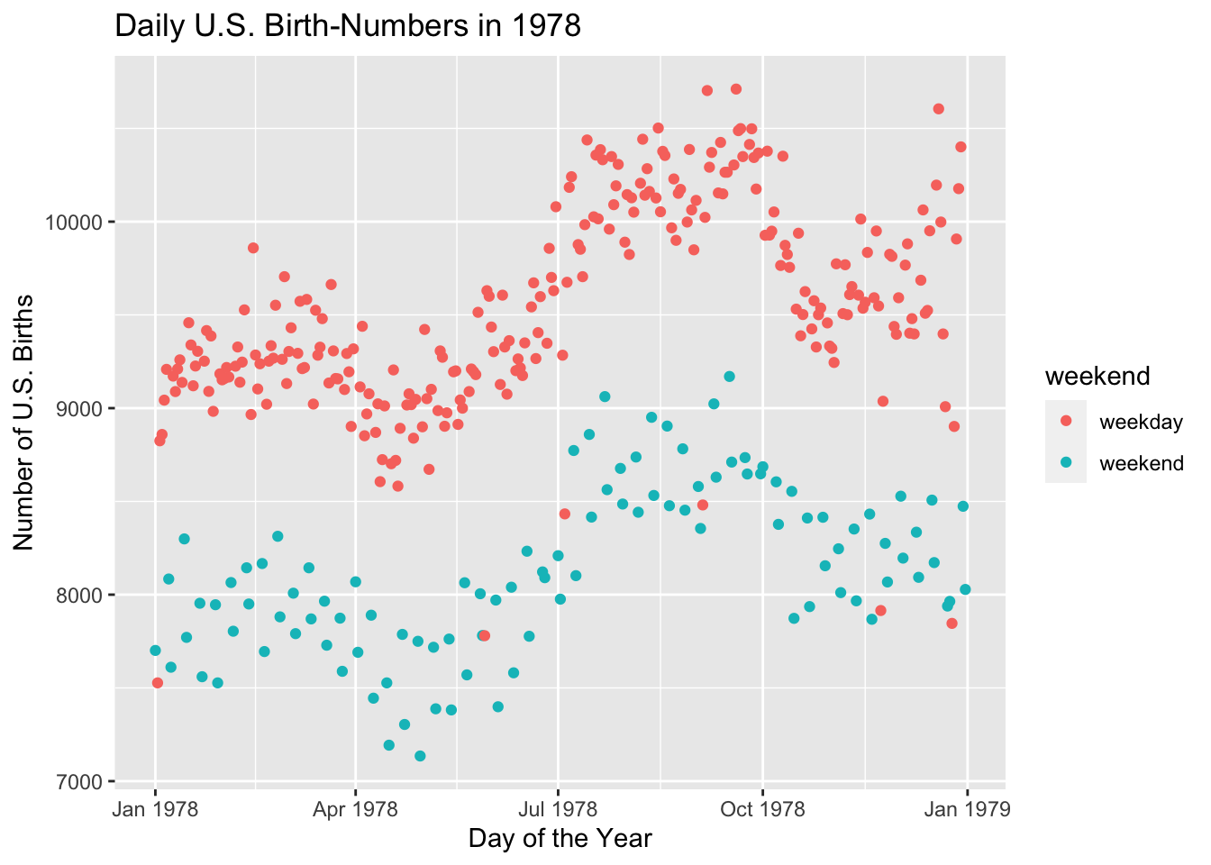
Figure 8.32: The days with fewer births are almost always weekend-days.
Well, a few of the points in the lower cloud are weekdays. Is there anything special about them? To find out, we subset the data frame to examine only those points:
df <- subset(Births78, weekend != "weekend" & births <= 8500)
df
## date births wday year month day_of_year day_of_month day_of_week weekend
## 2 1978-01-02 7527 Mon 1978 1 2 2 2 weekday
## 149 1978-05-29 7780 Mon 1978 5 149 29 2 weekday
## 185 1978-07-04 8433 Tue 1978 7 185 4 3 weekday
## 247 1978-09-04 8481 Mon 1978 9 247 4 2 weekday
## 327 1978-11-23 7915 Thu 1978 11 327 23 5 weekday
## 359 1978-12-25 7846 Mon 1978 12 359 25 2 weekdayIf you consult a calendar for the year 1978, you will find that every one of the above days was a major holiday. Apparently doctors prefer not to deliver babies on weekend and holidays. Scheduled births—induced births or births by non-emergency Cesarean section—are not usually set for weekends or holidays. Perhaps this accounts for the two clouds we saw in the original scatter plot.