Using lattice’s xyplot()
Preliminaries
The function xyplot() makes scatterplots to indicate the relationship between two numerical variables. It comes from the lattice package for statistical graphics, which is pre-installed with every distribution of R. Also, package tigerstats depends on lattice, so if you load tigerstats:
require(tigerstats)then lattice will be loaded as well.
Basic Scatterplot
Suppose you want to know:
Do students with higher GPA’s tend to drive more slowly than students with lower GPA’s?
If so, then you might check to see if numerical variable fastest (in the m111survey data frame from the tigerstats package) is related to the numerical variable GPA. Then you can make a scatterplot as follows:
xyplot(fastest~GPA,data=m111survey,
       xlab="grade point average",
       ylab="speed (mph)",
       main="Fastest Speed Ever Driven,\nby Grade Point Average")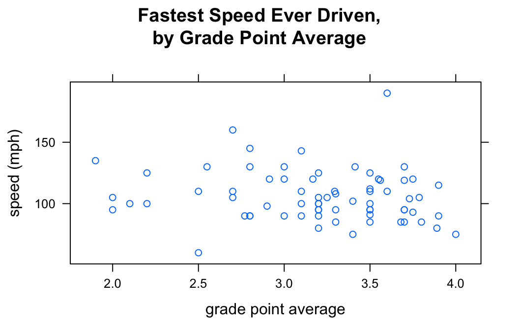
Note the use of:
- the
xlabargument to label the horizontal axis; - the
ylabargument to label the vertical axis, complete with units (miles per hour); - the
mainargument to provide a brief but descriptive title for the graph; - the “” to make two lines in the title (useful if you have a long title).
When we think of one variable as explanatory and the other as the response, it is common to put the explanatory on the horizontal axis and the response on the vertical axis. This is accomplished by the formula
\[response \sim explanatory\]
Including Smoothers
Adding a Regression Line
If you want desire a regression line along with your scatterplot, use the argument type, as follows:
xyplot(fastest~GPA,data=m111survey,
       xlab="grade point average",
       ylab="speed (mph)",
       main="Fastest Speed Ever Driven,\nby Grade Point Average",
       type=c("p","r"))
The list given by c("p","r") tells xyplot() that we want both the points (“p”) and a regression line (“r”).
Adding a Loess Curve
You can also get loess curves:
xyplot(fastest~GPA,data=m111survey,
       xlab="grade point average",
       ylab="speed (mph)",
       main="Fastest Speed Ever Driven,\nby Grade Point Average",
       type=c("p","smooth"))
Grouping
The groups argument enables you to introduce a third variable into your analysis, so long as that variable is a factor. For example, suppose you want to study the relationship between fastest and GPA, but see if the nature of relationship is different for women than it is for men. You can do this with the groups argument:
xyplot(fastest~GPA,data=m111survey,
       groups = sex,
       auto.key = TRUE,
       xlab="grade point average",
       ylab="speed (mph)",
       main="Fastest Speed Ever Driven,\nby Grade Point Average",
       type=c("p","r"))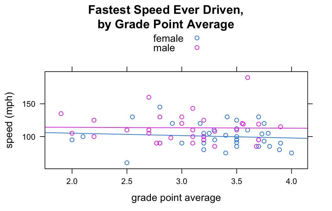
Setting groups = sex prodcued to scatterplots (with regression lines), one for the gals and another for the guys. The legend at the top of the graph was produced by auto.key = TRUE.
Types of Points
You can vary the type of point using the pch argument. For example:
xyplot(fastest~GPA,data=m111survey,
       xlab="grade point average",
       ylab="speed (mph)",
       main="Fastest Speed Ever Driven,\nby Grade Point Average",
       pch=19)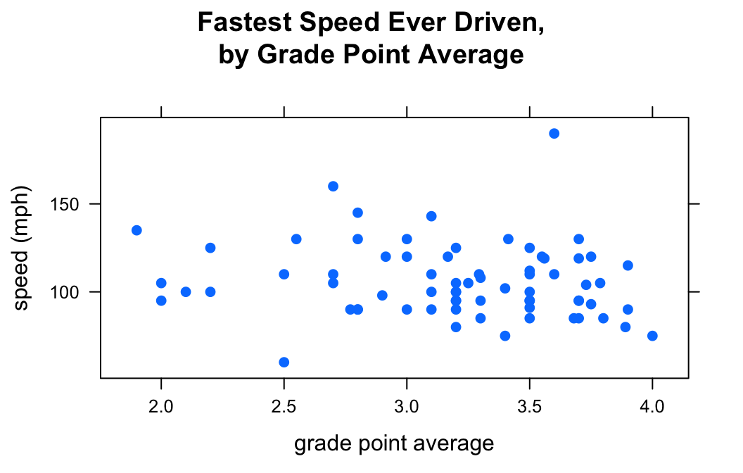
There are 25 different values for pch: the integers 1 through 25.
Colors
Single Color
If you want to set a specific color for all of the points on your plot, the col argument is your friend:
xyplot(fastest~GPA,data=m111survey,
       xlab="grade point average",
       ylab="speed (mph)",
       main="Fastest Speed Ever Driven,\nby Grade Point Average",
       pch = 19,
       col = "red")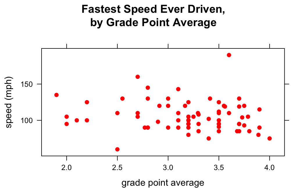
There are many, many values for col. You can explore all 657 of the named colors with the command:
colors()Color Schemes
When you use the groups argument, you may want to customize the colors that go with each group. This is accomplished by temporarily changing the lattice parameter settings via the par.settings argument. For example to make the female points blue and the male points red, do the following:
xyplot(fastest~GPA,data=m111survey,
       groups = sex,
       auto.key = TRUE,
       par.settings = list(superpose.symbol = list(col = c("blue","red"),
                                                   pch = 19),
                           superpose.line = list(col = c("blue","red"),
                                                 lwd = 2)),
       xlab="grade point average",
       ylab="speed (mph)",
       main="Fastest Speed Ever Driven,\nby Grade Point Average",
       type=c("p","smooth"))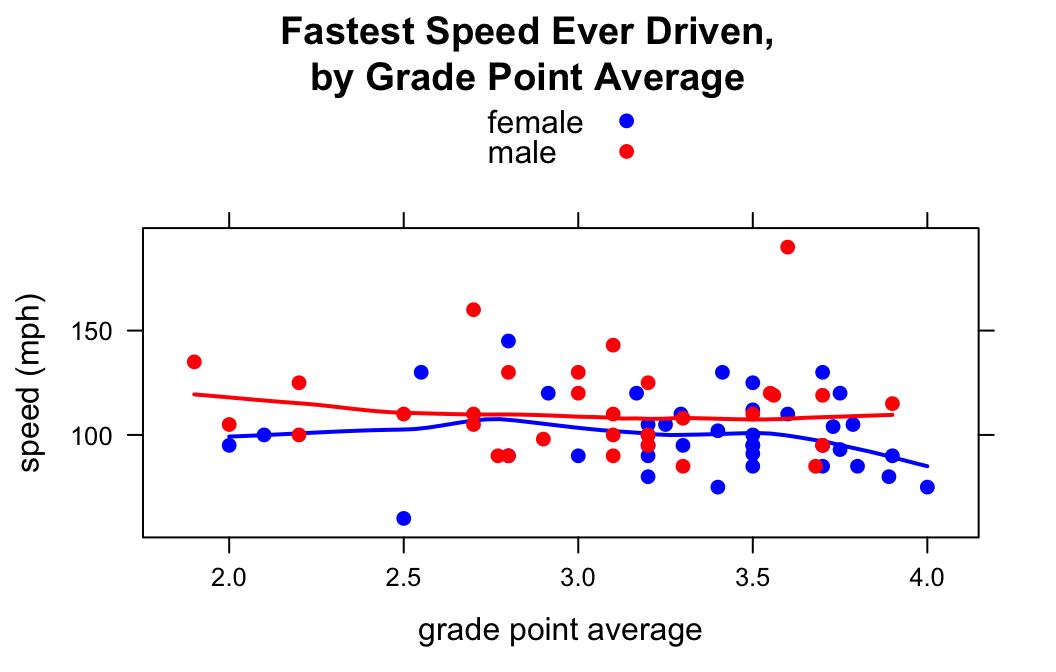
In par.settings the superpose.symbol list specifies properties of the points in the scatterlot. superpose.line specifies properties of the lines drawn for each group. (Setting lwd to 2 made the loess curves a bit thicker.)
Additional Variables
You can incorporate additional variables into your analysis by facetting, i.e., producing a plot with separate panels for each of several subgroups of the observations, as determined by one or two other variables. Unlike the variable in the groups argument, these don’t have to be factor variables!
Suppose, for example, that we would like to study the relationship between GPA and fastest speed ever driven, but to break the subjects down further into groups determined by their height and by where they prefer to sit in a classroom. The following code accomplishes this:
Height <- equal.count(m111survey$height, number = 2, overlap = 0.1)
xyplot(fastest ~ GPA | Height * seat,
    data = m111survey, pch = 19, type = c("p","r"),
    layout = c(2,3))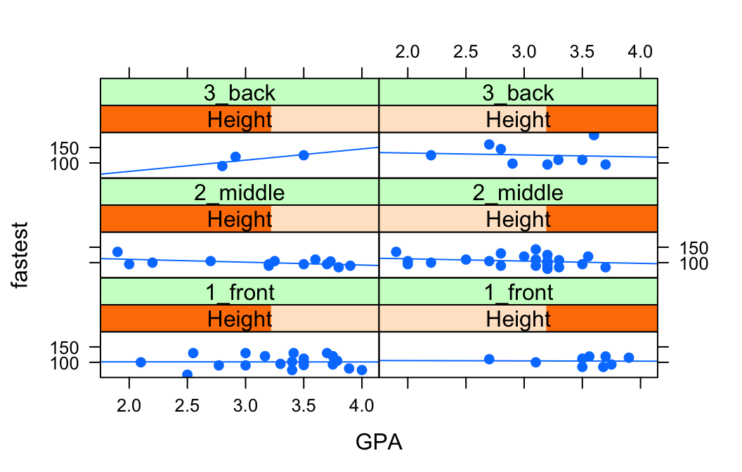
In the code above, the line:
Height <- equal.count(m111survey$height, number = 2, overlap = 0.1)prepares us to facet by height. The equal.count() function takes a numerical variable and divides its values into groups of approximately equal size. The number of the groups is specified by the number argument. In this case we are asking for two groups: “shorter” students and “taller” students. The groups are permitted to contain some members in common, and the allowed percentage intersection is specified by the overlap argument. (Setting overlap = 0 would result in completely disjoint groups.) The new variable Height is called a shingle, but you can think of it as a factor variable with two values: shorter and taller.
The formula fastest ~ sex | Height * seat facets by Height and seat. The variables by which you facet appear after a | bar, anf if you facet by two variables then you must separate them with a *. Since Height has two values and `seat has three values and \(2 \times 3 = 6\), we arrive at a plot with six panels.
The layout argument determines the number of rows and columns in our facet-ted plot. Setting layout to c(2,3) specified two columns and three rows. (Note that the columns are specified first!)
Further Refinements
For other refinements, consult the Lattice Scatter Plot Addin in RStudio.