Using lattice’s densityplot()
Preliminaries
The function densityplot() is used to study the distribution of a numerical variable. It comes from the lattice package for statistical graphics, which is pre-installed with every distribution of R. Also, package tigerstats depends on lattice, so if you load tigerstats:
require(tigerstats)then lattice will be loaded as well.
One Numerical Variable
In the m11survey data frame from the tigerstats package, suppose that you want to study the distribution of fastest, the fastest speed one has ever driven. You can do so with the following command:
densityplot(~fastest,data=m111survey,
       xlab="speed (mph)",
       main="Fastest Speed Ever Driven")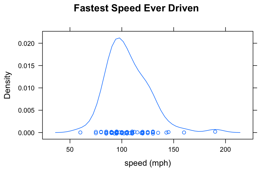
Note the use of:
- the
xlabargument to label the horizontal axis, complete with units (miles per hour); - the
mainargument to provide a brief but descriptive title for the graph.
If you do not want to see the “rug” of individual data values at the bottom of the plot, set the argument plot.points to FALSE:
densityplot(~fastest,data=m111survey,
       xlab="speed (mph)",
       main="Fastest Speed Ever Driven",
       plot.points=FALSE)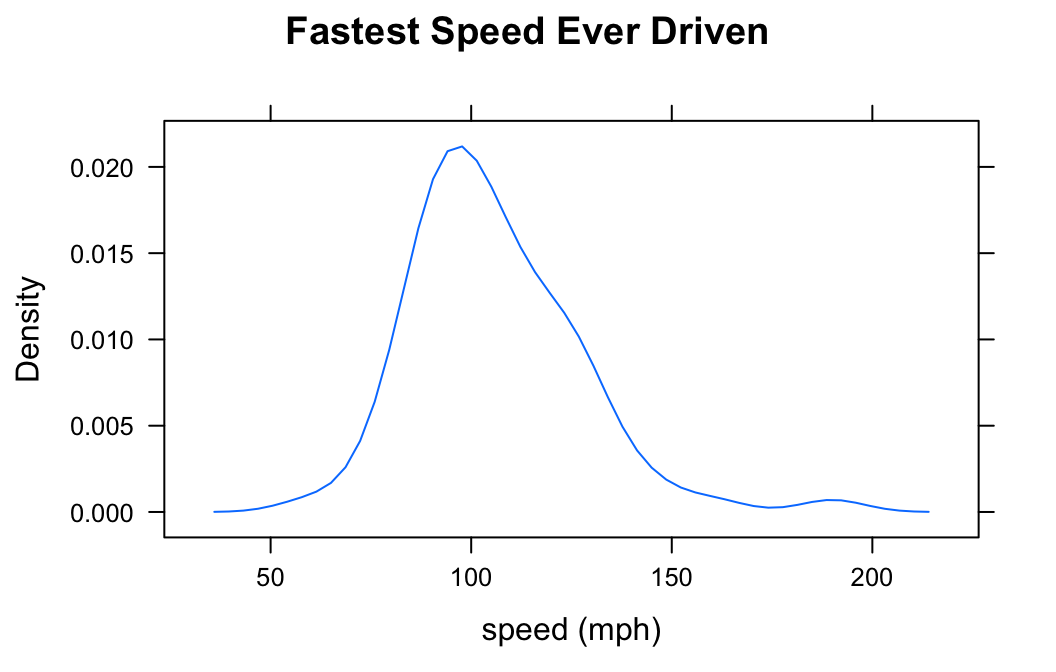
Numerical and Factor Variable
Suppose you want to know:
Who tends to drive faster: guys or gals?
Then you might wish to study the relationship between the numerical variable fastest and the factor variable sex. You can use density plots in two ways in order to perform such a study.
Separate Panels
You can get a density plot for each value of the factor variable:
densityplot(~fastest|sex,data=m111survey,
       xlab="speed (mph)",
       main="Fastest Speed Ever Driven,\nby Sex")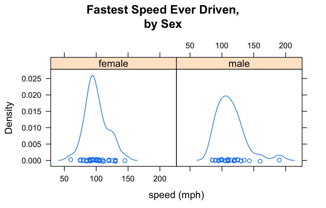
Note that to produce separate plots, you facet on the factor variable using the formula:
\[\sim numerical\ \vert \ factor\]
Note also the use of “\n” to split the title into two lines: this is a useful trick when the title is long.
You can determine the layout of the separate plots with the layout argument:
densityplot(~fastest|sex,data=m111survey,
       xlab="speed (mph)",
       main="Fastest Speed Ever Driven,\nby Sex",
       layout=c(1,2))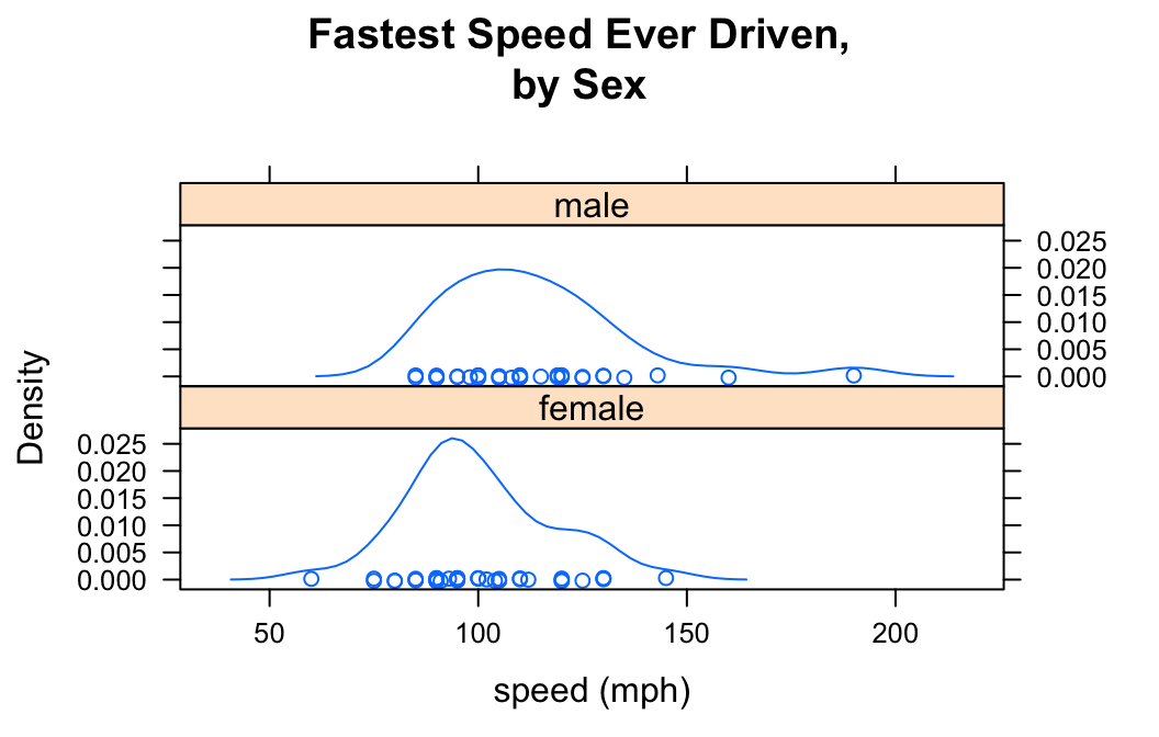
Here in the list c(1,2), the “1” says that you want one column, and the “2” says you want two rows.
Plots in the Same Panel
You can get a density plot for each value of the factor variable and have all of the plots appear in the same panel. This is accomplished with the groups argument:
densityplot(~fastest,data=m111survey,
       groups=sex,
       xlab="speed (mph)",
       main="Fastest Speed Ever Driven,\nby Sex",
       plot.points=FALSE,
       auto.key=TRUE)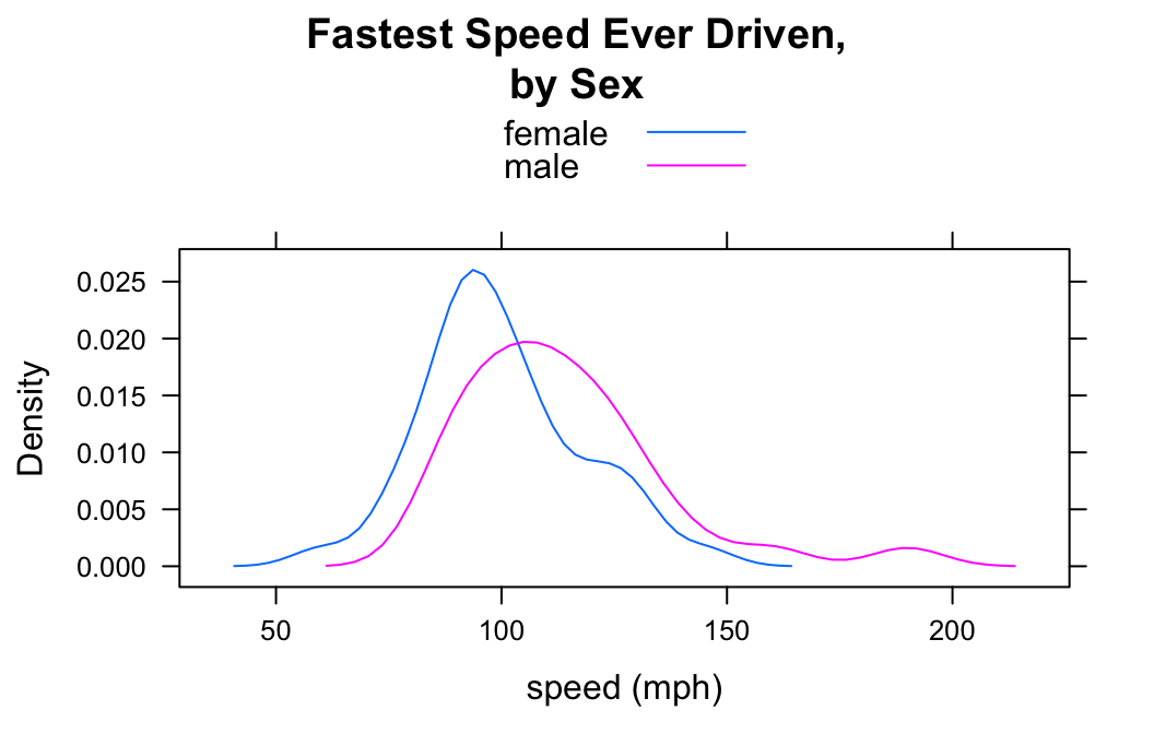
Note the use of the auto,key argument to produce the legend at the top, so that the reader can tell which plot goes with which sex.
Many people think that grouped density plots allow for easier comparison than side-by-side plots do—at least if the number of groups is small.
Setting the Colors
When you use groups arugment to make more than one density plot in the same panel, it is sometimes nice to be able to customize the colors that represent the groups. This is accomplished by temporarily changing the lattice parameter settings via the par.settings argument. For example to make the female plot blue and the male plot red, do the following:
densityplot(~fastest,data=m111survey,
       groups=sex,
       par.settings = list(superpose.line = list(col = c("blue","red"))),
       xlab="speed (mph)",
       main="Fastest Speed Ever Driven,\nby Sex",
       plot.points=FALSE,
       auto.key=TRUE)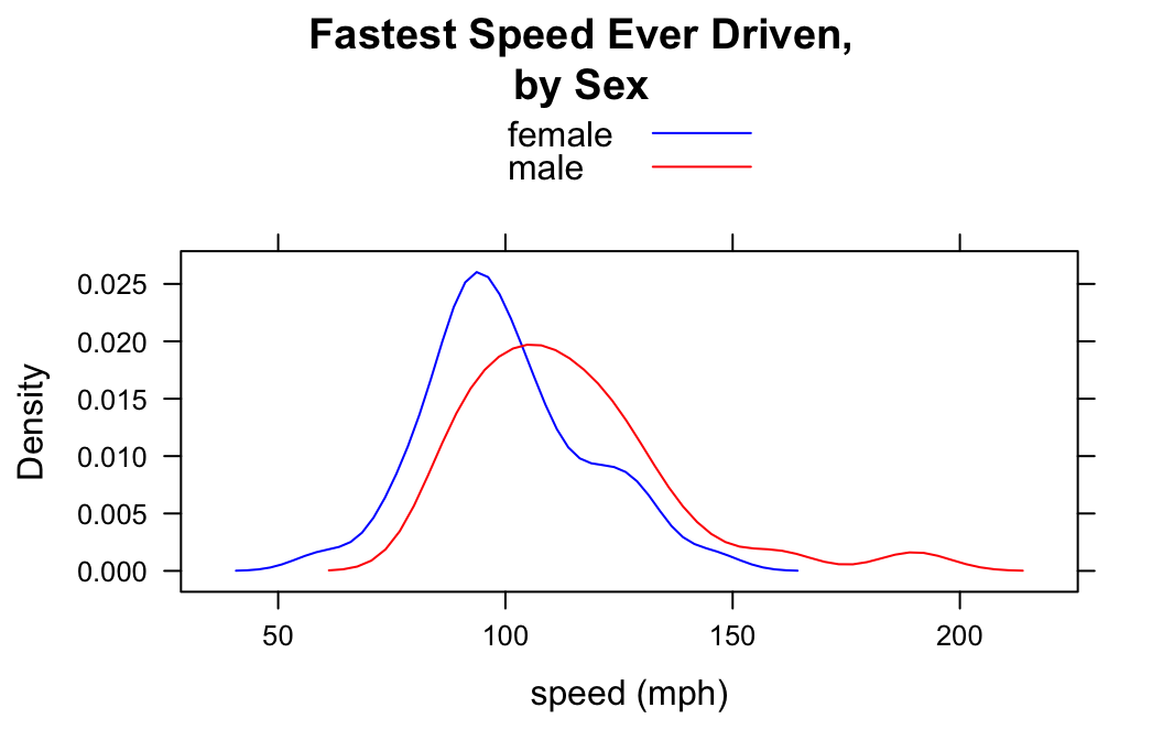
From and To
In the imagpop data frame, the variable kkardashtemp records the rating given, by each individual in the data frame, for the celebrity Kim Kardashian. The possible ratings range from 0 to 100.
Let’s make a density plot of this variable:
densityplot(~kkardashtemp,data=imagpop,
            plot.points=FALSE)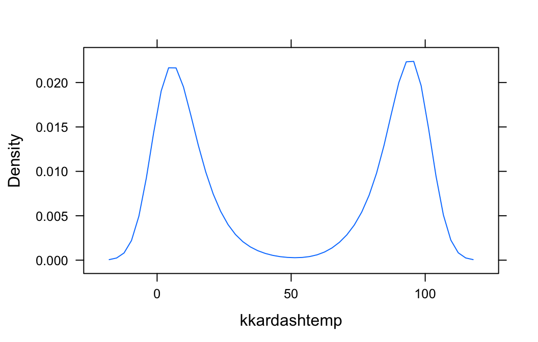
The function densityplot() has no way of knowing that kkardashtemp must lie between 0 and 100, so from the available data it infers that there is some possibility for a rating to be below 0 or above 100. If you want to inform denistyplot() of the known limits, then use the from and to arguments, as follows:
densityplot(~kkardashtemp,data=imagpop,
            plot.points=FALSE,
            from=0,to=100)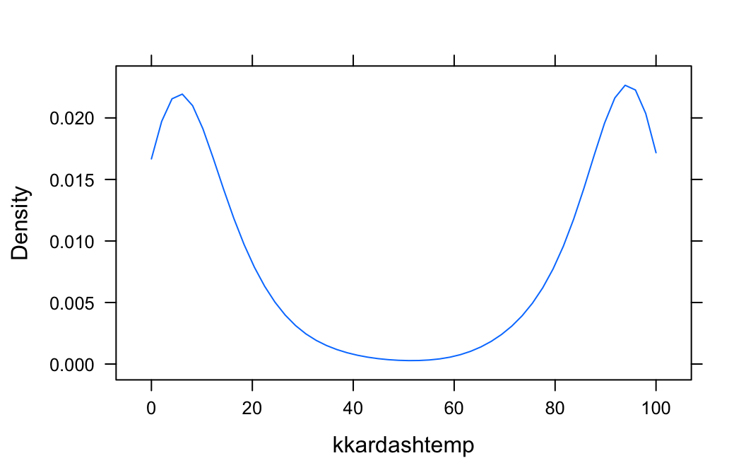
Additional Variables
We saw above that you can incorporate additional variables into your analysis by facetting, i.e., producing a plot with separate panels for each of several subgroups of the observations, as determined by a separate variable. You can also do this with two other variables, and they don’t have to be factors!
Suppose, for example, that we would like to study the relationship between sex and fastest speed ever driven, but to break the subjects down further into groups determined by their height and by where they prefer to sit in a classroom. The following code accomplishes this:
Height <- equal.count(m111survey$height, number = 2, overlap = 0.1)
densityplot(~fastest | Height * seat,
  data = m111survey,
  groups = sex,
  auto.key = TRUE,
  plot.points = FALSE,
    layout = c(2,3))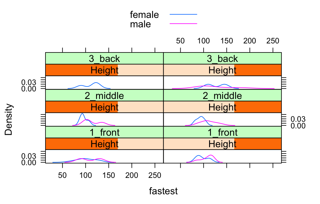
In the code above, the line:
Height <- equal.count(m111survey$height, number = 2, overlap = 0.1)prepares us to facet by height. The equal.count() function takes a numerical variable and divides its values into groups of approximately equal size. The number of the groups is specified by the number argument. In this case we are asking for two groups: “shorter” students and “taller” students. The groups are permitted to contain some members in common, and the allowed percentage intersection is specified by the overlap argument. (Setting overlap = 0 would result in completely disjoint groups.) The new variable Height is called a shingle, but you can think of it as a factor variable with two values: shorter and taller.
The formula fastest ~ sex | Height * seat facets by Height and seat. The variables by which you facet appear after a | bar, anf if you facet by two variables then you must separate them with a *. SinceHeight has two values and `seat has three values and \(2 \times 3 = 6\), we arrive at a plot with six panels.
The layout argument determines the number of rows and columns in our facet-ted plot. Setting layout to c(2,3) specified two columns and three rows. (Note that the columns are specified first!)
Further Refinements
For some other refinements, consult the Lattice Box-Whisker Plot Addin in RStudio.