Chapter 3 Relationships Between Two Factor Variables
3.1 Introduction
In Chapter Two we looked quickly at how to investigate the relationship between two factor variables. In the present chapter we will go into more depth on this topic.
First, a look at a Research Question from the m111survey data:
What is the relationship at Georgetown College between sex and how one feels about one’s weight?
This question, like most Research Questions, actually has two aspects:
- Descriptive Aspect: What is the relationship, in the sample data, between sex and how one feels about one’s weight?
- Inferential Aspect: Supposing we see a relationship in the data, how much evidence does the data provide for a relationship in the GC population at large between sex and how one feels about one’s weight? Does the data provide lots of evidence for a relationship in the population, or could the relationship we see in the data be due just to chance variation in the sampling process that yielded the data?
The previous chapter dealt with the descriptive aspect of Research Questions; in this chapter we will develop the descriptive aspect a bit more, and then turn to the inferential aspect.
3.2 The Descriptive Aspect
The current Research Question involves two factor variables from the m111survey data frame:
- sex. Its values are “male” and “female”
- weight_feel. Its values are:
- 1_underweight
- 2_about_right
- 3_overweight
From Chapter Two know that in order to study a relationship between two factor variables we begin with a two-way table:
SexWt <- xtabs(~sex+weight_feel,data=m111survey)
SexWt
## weight_feel
## sex 1_underweight 2_about_right 3_overweight
## female 1 11 28
## male 8 14 9We put sex first because in this study it is natural to consider it to be the explanatory variable: we think that one’s sex might, through cultural conditioning, affect how one feels about one’s weight.
3.2.1 Terminology for Two-Way Tables
The two-way table is called “two-way” because it has two dimensions: it has rows and columns.
- There are two rows, because the first variable sex has two values.
- There are three columns because the second variable weight_feel has three values.
Because there are two rows and three columns, the table has
\[2 \times 3=6\]
cells. In each cell, there is an observed count. For example, in the cell for males who feel underweight, the observed count is 8.
You can add up the observed counts in the rows to get row totals. For example, the row total for the first row is
\[1+ 11 + 28 = 40,\]
and this gives the total number of females in the study. If you add up the observed counts in the second row, you get 31, the total number of males in the study.
The sum of the row totals is called the grand total. It gives the total number of individuals in the study.
You can add up columns to get column totals, and if you add up column totals you will also get the grand total.
Below is the same two-way table, with an extra row and column for the totals:
##        1_underweight 2_about_right 3_overweight Total
## female             1            11           28    40
## male               8            14            9    31
## Total              9            25           37    71
The numbers in the Total column on the right of the table, excluding the Grand Total of 71, should be familiar: they are the tallies for the sex variable that we studied in chapter 2. Together they describe the distribution of sex. Because they occur in a margin of the two-way table, they are called the marginal distribution of sex. Similarly, the totals along the bottom give the marginal distribution of weight_feel.
However, when we are studying the relationship between sex and weight_feel, it doesn’t help much to know the marginal distributions. For example, the marginal distribution of sex tells us that a majority (40 out of 71) of the people in the study are female, and the marginal distribution of weight_feel tells us that a majority of the students in the study (37 out of 71) felt overweight. But these two facts don’t say anything about whether males and females differ in how they feel about their weight: they say nothing about the relationship between sex and weight_feel.
In order to address the relationship question, we have to find the distribution of weight_feel among the females, and the distribution of weight_feel among the males.
These two important distributions have special names:
- the distribution of weight_feel among the females is called the conditional distribution of weight_feel, given that sex is female.
- the distribution of weight_feel among the males is called the conditional distribution of weight_feel, given that sex is male.
If these two conditional distributions differ, then we will know that sex and weight_feel are related, in this sample of students.
Since the two sexes occur on two different rows of the two-way table, we can get them by computing row percentages:
rowPerc(SexWt)## weight_feel
## sex 1_underweight 2_about_right 3_overweight Total
## female 2.50 27.50 70.00 100.00
## male 25.81 45.16 29.03 100.00Let’s check a couple of the figures. Out of 40 females in the study, 28 thought they were overweight. Compute
28/40*100## [1] 70Sure enough, we get the 70% figure that we see in the table of row percents. The two-way table also tells us that 9 of the 31 males in the study thought they were overweight; as a percentage, that is:
9/31*100## [1] 29.03226Again, this agrees with the figure in the table of row percentages.
You can also get column percents (observed counts divided by column totals):
colPerc(SexWt)## weight_feel
## sex 1_underweight 2_about_right 3_overweight
## female 11.11 44 75.68
## male 88.89 56 24.32
## Total 100.00 100 100.00The column percents give you three conditional distributions:
- the conditional distribution of sex given that Weight_feel is “underweight” (the first column);
- the conditional distribution of sex given that Weight_feel is “about right” (the second column);
- the conditional distribution of sex given that Weight_feel is “overweight” (the third column).
Practice If we want to know the percentage of all men who feel that they are underweight, are we looking for a row percentage or a column percentage? What is the percentage?
The relevant fact here is that out of all 31 men, 8 think that they are underweight. These two numbers occur along a single row, so we are looking for a row percentage. From the row-percent table we see that this is 25.81%.
Practice If we want to know the percentage of men among all students who feel that they are overweight, are we looking for a row percentage or a column percentage? What is the percentage?
This time we focus on all students who feel they are overweight (37 total), and we see that 9 of them are men. This time the two numbers occur in a single column, so we want the column percentage, which is 24.32%.
Practice Suppose we want the percentage of all people who are men and who feel that they are overweight: is this a row percentage, a column percentage, or neither?
There are 9 people who are men and who think that they are overweight. The grand total is 71 people, so the percentage of all people who are men and who feel they are overweight is
9/71*100## [1] 12.67606This is neither a row percentage nor a column percentage.
3.2.1.1 Barchart Reminder
Remember that you can use barcharts to investigate graphically the relationship between two factor variables. Flat barcharts can be especially useful (see Figure [Sex and feeling about weight]):
barchartGC(SexWt,
           type="percent",
           ylab="Sex",flat=TRUE)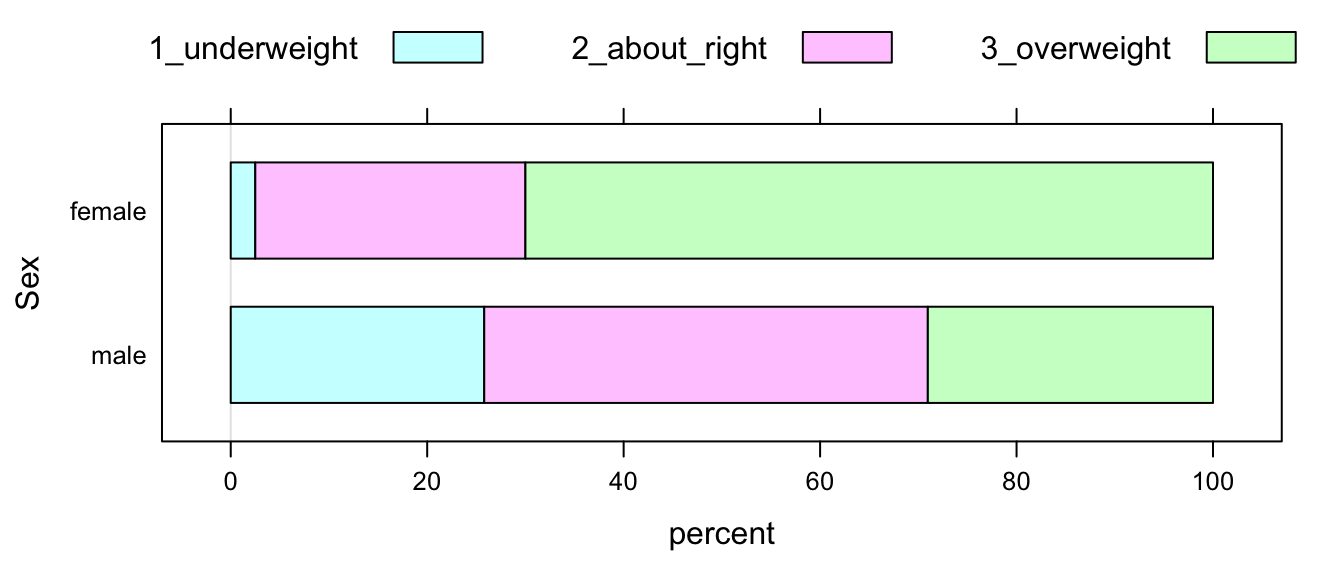
Figure 3.1: Sex and feeling about weight at GC
3.2.2 Detecting and Describing Relationships
3.2.2.1 Detection
Let’s focus back on the conditional distributions of weight_feel, given sex:
rowPerc(SexWt)## weight_feel
## sex 1_underweight 2_about_right 3_overweight Total
## female 2.50 27.50 70.00 100.00
## male 25.81 45.16 29.03 100.00These two distributions obviously differ. For example, 70% of women feel overweight, but only 29.03% of the men feel overweight. This tells us that the women in the sample are more likely to feel overweight than the men in the sample are. We have just discovered that sex and weight_feel are related, in this sample!
This suggest a general procedure for detecting a relationship between two factor variables:
- Make a two-way table. If one of the variables is clearly the explanatory variable, put it along the rows.
- Make the table of row percents.
- Compare row percents down columns. If you find a column where the row percents differ substantially, this indicates a relationship between the variables. The bigger the difference, the stronger the relationship.
- If, in every column, the row percents are about the same, then there is little or no relationship between the two variables.
If you want, you could compute column percentages, and follow a similar procedure for them:
- When two variables are unrelated in a sample or in a population, then for every row in a two-way table, the column percentages do not change as you go across the row.
- If there is at least one row where the column percentages are not all the same, then there is some relationship between the two variables. The bigger the differences, the stronger the relationship.
When the explanatory variable is along the rows, as in our SexWt table, we usually look just at row percentages.
3.2.2.2 Description
How do we describe the relationship that we have detected? Here is one way:
“Sex and feeling about weight are related, in our sample data. For example, the males were more likely than the females to think that they were underweight (25.81% as compared to 2.50% for the females).”
The key is to communicate specifically the features of the data that allowed you to detect the relationship. This helps convince your reader that you are right. Be sure to use specific numbers from the table to back up your assertions.
Here is a check-list for detecting and describing a relationship between two factor variables.
- Compare row percents down columns.
- The bigger the differences down a column, the stronger the relationship.
- Your description should incorporate at least two row percents from the same column.
- Focus on columns with an important-looking difference. This could be a big difference in percentages, or where the percentages may not differ so much but are based on high cell counts.
- Don’t incorporate too many percents in your description. The reader can always look back at the table for more info.
3.2.2.3 Warning
Consider the following made-up data. Suppose that George plants 100 seeds in plot A, and 200 seeds in plot B. One week later, he finds that 70 in plot A have sprouted, and that 140 in plot B have sprouted. He makes a two-way table:
##        sprouted not.sprouted
## Plot.A       70           30
## Plot.B      140           60
George wants to see if there is a relationship, in the data, between type of plot and whether or not a seed sprouts in the first week. He computes row percentages
##        sprouted not.sprouted Total
## Plot.A       70           30   100
## Plot.B       70           30   100
George describes the relationship as follows: “There is a strong relationship between type of plot and sprouting: in both plots, a considerable majority of seeds sprouted within one week (70% sprouting vs. 30% not sprouting).”
George is quite mistaken, however. In fact there is no relationship at all between type of plot and whether a seed sprouts: the conditional distributions of sprouting, given plot, are both identical! (The row percents are the same, as you go down any single column.) Intuitively, this tells you that plot-type makes no difference in whether or not a seed sprouts.
3.3 The Idea of Inference
So maybe we have examined a two-way table based on sample data, and have detected a relationship between the two factor variables under study. Great! We’ve found a pattern in our data. But:
- does that pattern in our data exist in the population at large, or
- could it be that there is no pattern in the population, and that the pattern in the data is the product solely of chance variation in the data-collection process?
A quick-and-dirty way to ask the question is as follows:
- Is the data-pattern real, or
- just due to chance?
The question is actually quite complex. For our first time through, it’s best to work with a small dataset.
data(ledgejump)
View(ledgejump)
help(ledgejump)
As we learn from help(), this data frame is constructed from 21 recorded incidents in England, in which a suicidal person was contemplating jumping from a ledge or other high structure and a crowd gathered to watch. The weather at the time of the incident is recorded, along with the behavior of the crowd.
Our Research Question is:
Does the weather affect the way the crowd behaves?
In other words, is there a relationship between weather and crowd.behavior?
First, we will detect and describe the relationship in the data. We make the two-way table:
WeBe <- xtabs(~weather+crowd.behavior,data=ledgejump)
WeBe
## crowd.behavior
## weather baiting polite
## cool 2 7
## warm 8 4Next we make row percents:
rowPerc(WeBe)## crowd.behavior
## weather baiting polite Total
## cool 22.22 77.78 100.00
## warm 66.67 33.33 100.00In the data there appears to be a strong relationship between weather and crowd behavior: when the weather was warm, the crowd was far more likely to bait the would-be jumper than when the weather was cool (66.67% baiting in warm weather vs. 22.22% baiting in cool weather).
But is this data-pattern real, or just due to chance? After all, there are many other factors besides weather that can influence a crowd’s behavior, for example:
- the size of the crowd (the larger the crowd, the more likely it is to be unruly);
- how long the crowd has to wait for the incident to be resolved;
- the personality/behavior of the would-be jumper, etc.
We model these other factors as “chance.” If we could go back into time and watch the same 21 incidents, they would play out differently because of the other chance factors. We would probably not get exactly the same two-way table.
A natural question arises: if there is no relationship between weather and crowd behavior, what two-way table would we EXPECT to see? In other words: what cell counts would we expect to see?
We can estimate these expected cell counts. Here’s the chain of reasoning that will produce our estimates:
There was a grand total of 21 incidents. Of these 21 incidents, the crowd baited 10 times. That’s
\[10/21*100 = 47.6\]
percent. The crowd was polite 11 times, or
\[11/21*100 = 52.4\]
percent of the time. So if there is no relationship, our best guess is that the crowd baits 47.6% of the time and is polite 52.4% of the time. So if we could run the study all over again and there is no relationship, then our best guess is that out of the 9 warm-weather incidents, the crowd would bait in 47.6% of them: that’s
\[\frac{10}{21} \times 9 = 4.29\]
times. Hence 4.29 is our estimate of the expected cell count for the warm-baiting cell of the two-way table.
Also, if we could run the study all over again and there is no relationship, then our best guess is that out of the 9 warm-weather incidents, the crowd would be polite in 52.4% of them: that’s
\[\frac{11}{21} \times 9 = 4.71\]
times. Hence 4.71 will be our estimate of the expected cell count for the warm-polite cell of the two-way table.
There is a pattern in the above reasoning: to estimate an expected cell count if there is no relationship, compute
\[\frac{colSum}{GrandTotal} \times rowSum\]
for that cell.
Using this formula, we can compute expected cell counts for the remaining cells. For the cool-baiting cell, the column sum is \(8+2=10\) and the row sum is \(8+4=12\). The grand total is 21, so the expected cell count is:
10/21*12## [1] 5.714286which is about 5.71, if we round to two decimal places. For the cool-polite cell, we get:
11/21*12## [1] 6.285714which is about 6.29. The table of expected cell counts is:
## baiting polite
## cool 4.29 4.71
## warm 5.71 6.29That’s the table you would expect to see, if there is no relationship between weather and crowd behavior.
Well, not exactly, of course:
- There is no such thing as 4.29 crowds!
- Also, when chance is involved, you don’t expect to see exactly what you expect!
The idea is that someone who believes that there is no relationship between weather and crowd behavior would expect to see about 4.29 in the warm-baiting cell, give or take a bit for chance error in the data-collection process.
There certainly are some differences between what one would expect, and what we actually saw. The following table shows what you get if you subtract the expected cell count from the actual cell count, in each cell:
## crowd.behavior
## weather baiting polite
## cool -2.29 2.29
## warm 2.29 -2.29There are four cells in our table, so there are four differences. We would like to find one number that provides an overall measure of the difference between the observed table and the expected one.
One well-known measure is called the chi-square statistic. To find it:
- Square the differences between observed and expected counts
- Divide each squared difference by the expected count
- Add them all up
Let’s try it out on our table:
(2-4.29)^2/4.29+(7-4.71)^2/4.71+(8-5.71)^2/5.71+(4-6.29)^2/6.29## [1] 4.087924We get about 4.09. (The actual value is closer to 4.07: our-round-offs along the way led to some error.)
Here are some facts about the chi-square statistic:
- It is always at least 0.
- The only time it is 0 is when you observe exactly what one would expect if there is no relationship.
- The bigger the statistic, the bigger the difference between observed and expected.
Now, back to our big question: “Is the data-pattern real, or is it just due to chance?” We can rephrase the question as follows: “We got a chi-square of 4.07. How likely is to get 4.07 or more, just by chance?”
Well, we find probabilities by repeating an experiment many times. The following app allows us to explore what would happen if we could repeat the study several times on the same 21 incidents, under the assumption that there is no relationship between weather and crowd behavior.
require(manipulate)
ChisqSimSlow(~weather+crowd.behavior,
data=ledgejump, effects="fixed")We find that if there is no relationship between weather and crowd.behavior, then there is a bit more than a 5% chance of getting a chi-square statistic of 4.07 or more, as we did in the actual study.
This probability–the chance of getting a chi-square statistic at least as big as the one we actually got, if there is no relationship–is called a P-value. The smaller the P-value, the more evidence the data provides against the idea that there is no relationship. The smaller the P-value, the less reasonable it is for someone to claim that there is no relationship, that the results are due just to chance variation.
How small should the P-value be, in order to rule out the claim of no relationship? There is no one natural “cut-off”, but as a convention we say that it is 0.05 (or 5%).
This time, the P-value appears to be a bit more than 5%. We might be suspicious that weather and crowd behavior are related, but with the amount of data on hand we cannot quite rule out the idea that our results are due solely to chance variation. (Maybe we should study more ledge-jumping incidents!)
3.4 Tests of Significance
3.4.1 Five Step Procedure
The chain of reasoning we followed in the ledge-jump study is so common in inferential statistics that it has a name: it is called a test of signifiance, or a test of hypothesis. It will be repeated so many times that we should learn to break it down into steps, and to assign special names to important components of the argument.
Step One. State Null and Alternative Hypotheses.
The Null Hypothesis always involves the claim that there is no particular pattern in the population, or in the process that resulted in the data under study. When we are investigating the relationship between two variables, it claims “no relationship.”
\(H_0:\) There is no relationship between weather and crowd behavior.
This is not a claim that there is no relationship in the sample data. Rather, it is a claim that weather and crowd behavior are independent, and that the pattern we got in the data was just chance variation.
The Alternative Hypothesis always contradicts the Null Hypothesis, in one way or another. In this topic, the Alternative claims:
\(H_a:\) There is a relationship between weather and crowd behavior.
Again, this is NOT a claim that weather and crowd behavior are related in the sample data: everyone agrees that there is a relationship in the sample. Rather, the Alternative is claiming that the relationship in the sample is so strong that it exists because of a real relationship between weather and crowd behavior, not because of chance variation in the 21 incidents under study.
Step Two. Compute a test statistic.
The test statistic is a number that depends on the data. The formula for the test statistic is chosen so that the bigger it is, the more the data differ from what the Null Hypothesis expects to see. This time, the test statistic is the chi-square statistic, and its value is about 4.07.
Step Three. Compute the P-value.
By definition, the P-value is always:
the probability of getting a test statistic at least as extreme as the one you got, if \(H_0\) were true.
We can approximate the P-value by simulating the study many times, under conditions where \(H_0\) is true. Statisticians often have short-cut ways to calculate P-values, and you will learn about them as we go along.
This time, the P-value was a little over 5%, we think.
It is a very good idea to pause at this point and to construct a practical intepretation of the P-value that we have obtained. This interpretation is basically a restatement of the definition of the term “P-value”, with the specific context of the problem inserted in place of the abstract terminology. Here is a fine practical interpretation of the P-value in this study:
If there is no relationship between weather and crowd behavior, then there is a bit more than a 5% chance of getting a test statistic at least as big as the 4.07 value that we got in the actual study.
Notice that we used the numerical value of the P-value in our interpretation. This tells the audience just how likely or unlikely it is to get results of the sort we got, if the Null is true.
Step Four. Decide whether or not to reject \(H_0\).
We always make this decision on the basis of our P-value, and on the “cut-off” value, which has been set at 0.05.
- If P < 0.05, we reject \(H_0\), and we say that our results are statistically significant.
- If P \(\geq\) 0.05, we do not reject \(H_0\), and we do not say that our results are statistically significant.
This time, we don’t reject \(H_0\). (But we are suspicious anyway that \(H_0\) might be wrong.)
Notice how important it is to be able to interpret your P-value. It’s the interpretation of the P-value that really makes the case for whether we should rule out the the Null Hypothesis as unreasonable.
Step Five: Report a conclusion.
We always write a brief conclusion, stated in the context of the problem. This means that we don’t use a lot of technical terminology such as “P-value” or “chi-square statistic”: we just state our conclusion in such a way that anyone who can understand the Research Question can understand our conclusion.
In this example, we might conclude:
The data do not quite provide strong evidence for a relationship between weather and crowd behavior.
As a rule, the conclusion should say how strong the evidence is against \(H_0\). Equivalently, it could say how strong the evidence is for \(H_a\) (which is how we chose to state it just now).
Note: Interestingly, the tests of significance that we perform in this book often cannot provide positive evidence for a Null hypothesis. When you decide not to reject \(H_0\), you should avoid wording your conclusion as “the data provided so-and-so much evidence for” the Null.
For additional practice, let’s consider another example. This time our Research Question is:
In the student population at Georgetown College, is there a relationship between one’s sex and where one prefers to sit in a classroom?
To start our investigation, we perform descriptive statistics, so we can figure out if there is a relationship in the sample data.
Make the two-way table:
SexSeat <- xtabs(~sex+seat,data=m111survey)
SexSeat## seat
## sex 1_front 2_middle 3_back
## female 19 16 5
## male 8 16 7Compute row percents:
rowPerc(SexSeat)## seat
## sex 1_front 2_middle 3_back Total
## female 47.50 40.00 12.50 100.00
## male 25.81 51.61 22.58 100.00As we saw in Chapter 2, it appears that in the sample the females are more likely than the males to prefer the front (47.5% vs. 25.81% for the guys).
Now we go for the inferential statistics: we will perform a test of significance.
Step One: The hypotheses are:
\(H_0\): There is no relationship, in the GC population, between sex and seating preference.
\(H_a\): There is a relationship, in the population, between sex and seating preference.
Step Two: Compute the test statistic.
Step Three: Compute the P-value.
For these two steps, let’s use the app again:
ChisqSimSlow(~sex+seat,
data=m111survey,effects="random")Note: When your data is a random sample from some larger population, we recommend that you set the effects argument to “random.” (See GeekNotes for an explanation.)
The chi-square statistic was 3.73. After some work, we approximated the P-value as somewhere around 16%. This means:
If sex and seat are unrelated in the GC population, then there is about a 16% chance of getting a test statistic of 3.73 or more, as we got in our study.
Step Four Make a decision about \(H_0\).
Since P = 0.16 > 0.05, we do not reject \(H_0\).
Step Five: Write a conclusion.
The sample data did not provide strong evidence for a relationship between sex and seating preference in the Georgetown College population.
3.4.2 More on the Chi-Square Statistic
The degrees of freedom for a two-way table (df for short) is an important quantity in statistical theory. It is defined as:
\[df = {(NumbRows -1)} \times {(NumbCols -1)}.\]
For the Sex and Seat table, the \(df\) is \((2-1) \times (3-1) = 2\).
Statistical theory says that, if \(H_0\) is true and we have taken a fairly large sample, then in repeated re-sampling the chi-square statistic should be, on average, equal to the \(df\). Also, the standard deviation of the re-sampled chi-square statistic should be about \(\sqrt{2 \times df}\). In this case, the SD should be about \(\sqrt{4}=2\).
You can use the mean and the SD as an advance indicator to whether or not \(H_0\) looks reasonable. If the test statistic is many SDs above the df, then things look pretty bad for the Null.
3.4.3 chisqtestGC()
Statisticians can often derive short-cut ways to compute P-values, and these methods are written up into R-functions. May we suggest the use of the function chisqtestGC().
chisqtestGC(~sex+seat,data=m111survey)## Pearson's Chi-squared test
##
## Observed Counts:
## seat
## sex 1_front 2_middle 3_back
## female 19 16 5
## male 8 16 7
##
## Counts Expected by Null:
## seat
## sex 1_front 2_middle 3_back
## female 15.21 18.03 6.76
## male 11.79 13.97 5.24
##
## Contributions to the chi-square statistic:
## seat
## sex 1_front 2_middle 3_back
## female 0.94 0.23 0.46
## male 1.22 0.29 0.59
##
##
## Chi-Square Statistic = 3.734
## Degrees of Freedom of the table = 2
## P-Value = 0.1546You get the test statistic and the P-value that you need to write up a test of significance. You get more information, too, such as a table of observed counts and a table of expected counts.
You should still write out all five steps of a test, even when you use a pre-made R-function. Here is how we would write up the test using such a function.
Step One: The hypotheses are:
\(H_0\): There is no relationship, in the GC population, between sex and seating preference.
\(H_a\): There is a relationship, in the population, between sex and seating preference.
Step Two: Compute the test statistic.
Just run the test:
chisqtestGC(~sex+seat,data=m111survey)## Pearson's Chi-squared test
##
## Observed Counts:
## seat
## sex 1_front 2_middle 3_back
## female 19 16 5
## male 8 16 7
##
## Counts Expected by Null:
## seat
## sex 1_front 2_middle 3_back
## female 15.21 18.03 6.76
## male 11.79 13.97 5.24
##
## Contributions to the chi-square statistic:
## seat
## sex 1_front 2_middle 3_back
## female 0.94 0.23 0.46
## male 1.22 0.29 0.59
##
##
## Chi-Square Statistic = 3.734
## Degrees of Freedom of the table = 2
## P-Value = 0.1546The chi-square statistic is about 3.73. The degrees of freedom for this table is reported to be 2, so if the Null is right you would expect the chi square statistic to turn out to be around 2, give or take
\[\sqrt{2 \times df} =\sqrt{2 \times 2}=\sqrt{4}=2\]
or so. The value of 3.73 that we got isn’t even one SD above 2, so if the Null is right then our results aren’t very surprising.
Step Three Report the P-value.
The test output showed the P-value as about 0.155. Sure enough, results like ours aren’t terribly unlikely to occur, if the Null is right.
Step Four Make a decision about \(H_0\).
Since P = 0.155 > 0.05, we do not reject \(H_0\).
Step Five: Write a conclusion.
The sample data did not provide strong evidence for a relationship between sex and seating preference in the Georgetown College population.
Here is one more example. Learn about the General Social Survey:
data(gss02)
View(gss02)
help(gss02)The General Social Survey (GSS) is a nationwide poll that has been conducted since 1972 (semiannually since 1994). Most interviews are done face-to-face. The questions asked vary from year to year, and not every subject is asked the same set of question. The data frame gss02 provides a selection of variables corresponding to questions asked of subjects in the year 2002.
Let say we are interested in the Research Question:
Is there any association between one’s race and whether or not one owns a gun?
This is a question about the relationship between two factor variables:
- race, with possible values:
- African American
- Hispanic
- Other
- White
- owngun (whether or not the subject owns a gun). The possible values are:
- Yes
- No
In this study we’ll think of race as explanatory and gunlaw as response.
Here we go with the test of significance:
Step One: The hypotheses are:
\(H_0\): There is no relationship, in the United States population, between race and gun ownership.
\(H_a\): There is a relationship, in the U.S. population, between these two variables.
Step Two: Compute the test statistic.
We run the test:
chisqtestGC(~race+owngun,data=gss02)## Pearson's Chi-squared test
##
## Observed Counts:
## owngun
## race No Yes
## AfrAm 106 16
## Hispanic 20 3
## Other 25 7
## White 454 284
##
## Counts Expected by Null:
## owngun
## race No Yes
## AfrAm 80.67 41.33
## Hispanic 15.21 7.79
## Other 21.16 10.84
## White 487.97 250.03
##
## Contributions to the chi-square statistic:
## owngun
## race No Yes
## AfrAm 7.96 15.53
## Hispanic 1.51 2.95
## Other 0.70 1.36
## White 2.36 4.61
##
##
## Chi-Square Statistic = 36.9779
## Degrees of Freedom of the table = 3
## P-Value = 0The chi-square statistic is about 36.98. The degrees of freedom for this table is reported to be 3, so if the Null is right you would expect the chi-square statistic to turn out to be around 3, give or take
\[\sqrt{2 \times df} =\sqrt{2 \times 3}=\sqrt{6} \sim 2.45\]
or so. The value of 36.98 that we got is many SDs above 3, so if the Null is right then our results are incredibly surprising.
Step Three Report the P-value.
The test output showed the P-value as about 4.651151e-08. This is in scientific notation, and it equals
\[4.651151 \times 10^{-8} \sim 0.000000046,\]
or about 5 in 100 million. so if the null is right, there is only about a 5 in 100 million chance of getting a test statistic at least as big as the one we got in this study.
Step Four Make a decision about \(H_0\).
Since \(P=4.65 \times 10^{-8} < 0.05\), we do reject \(H_0\).
Step Five: Write a conclusion.
The sample data provided very strong evidence for a relationship between race and gun ownership in the United States population.
We might want to describe the relationship a bit more. In order to do this, we should look at some row percentages:
rowPerc(xtabs(~race+owngun,data=gss02))## owngun
## race No Yes Total
## AfrAm 86.89 13.11 100.00
## Hispanic 86.96 13.04 100.00
## Other 78.12 21.88 100.00
## White 61.52 38.48 100.00We see that white folks are more likely to own guns than people of other races are: for example, 38% of whites own a gun, whereas only 13% of African American own a gun.
This is not to say that one’s race has a causal role in whether or not one owns a gun. We know that gun owners are predominantly rural, so if white people tend to be more rural than folks of other races are, that could make the difference. (In Chapter 6 we will look more deeply into questions about inferring causation from studies where an association is found between variables.)
3.4.4 Working With Summary Data
Sometimes you don’t have the raw data available, but you still want to study the relationship between two factor variables. The descriptive and inferential procedures are the same as always, but you have to make your own table first.
Example: Suppose that in the ledge-jump study we had 42 incidents. In 18 of them the weather was cool and in the remaining 24 the weather was warm. In 4 of the 18 cool-weather incidents, the crowd was baiting. In 16 of the 24 warm-weather incidents, the crowd was baiting. We want to know whether weather and crowd behavior are related.
From the information we see:
- 4 cool-baiting incident
- 14 cool-polite incidents (\(18-4=14\))
- 16 warm-baiting incidents
- 8 warm-polite incidents (\(24-16=8\))
We want a table that looks like this:
## baiting polite
## cool 4 14
## warm 16 8To get this table into R, we proceed in steps. First, make lists of the cool and the warm counts:
cool <- c(4,14)
warm <- c(16,8)Then “bind”" them together as two rows of a single table, using the rbind() function:
WeBe2 <- rbind(cool,warm)
WeBe2## [,1] [,2]
## cool 4 14
## warm 16 8This is good, except that it does not have names for the columns, so we set them as follows:
colnames(WeBe2) <- c("baiting","polite")
WeBe2## baiting polite
## cool 4 14
## warm 16 8That’s better. To check for a relationship in the data, we compute row percents:
rowPerc(WeBe2)## baiting polite Total
## cool 22.22 77.78 100.00
## warm 66.67 33.33 100.00We see the same strong relationship as before. In this imaginary example, we just doubled all of the counts, so the percentages stay the same!
Now for the inferential statistics:
Step One: The hypotheses are:
\(H_0\): There is no relationship between weather and crowd behavior.
\(H_a\): There is a relationship, between weather and crowd behavior.
Step Two: Compute the test statistic. Step Three: Report the P-value.
Again we can combine these steps, by putting the table into chisqtestGC():
chisqtestGC(WeBe2)## Pearson's Chi-squared test with Yates' continuity correction
##
## Observed Counts:
## baiting polite
## cool 4 14
## warm 16 8
##
## Counts Expected by Null:
## baiting polite
## cool 8.57 9.43
## warm 11.43 12.57
##
## Contributions to the chi-square statistic:
## baiting polite
## cool 2.44 2.22
## warm 1.83 1.66
##
##
## Chi-Square Statistic = 6.4611
## Degrees of Freedom of the table = 1
## P-Value = 0.011The chi-square statistic is about 6.46, and the P-value is about 0.01.
Step Four: Make a decision about \(H_0\).
Since P = 0.01 < 0.05, we do reject \(H_0\).
Step Five: Write a conclusion.
The sample data provided strong evidence for a relationship between weather and crowd behavior.
Note: The pattern in this imaginary study was exactly as strong as the pattern in the actual ledge-jump study, but it was based on twice as much data. Observe the effect on the P-value: it went down a lot from the original example! In general, the more data you have, the more powerful your test of significance will be, in the sense that it is more likely to reject \(H_0\) when \(H_0\) is false.
3.4.5 Simulating P-Values
Pre-made R-functions for tests are very convenient, but you have to be careful not to misuse them. When it comes to the chisq.test, statisticians say that you should only trust the P-value when the expected cell counts are all at least 5. (Some say that at least 80% of the expected cell counts should be at least 5, and that all of them should be at least 1.)
Consider what happens with the ledgejump data:
chisqtestGC(~weather+crowd.behavior,data=ledgejump)## Pearson's Chi-squared test with Yates' continuity correction
##
## Observed Counts:
##        crowd.behavior
## weather baiting polite
##    cool       2      7
##    warm       8      4
##
## Counts Expected by Null:
## crowd.behavior
## weather baiting polite
## cool 4.29 4.71
## warm 5.71 6.29
##
## Contributions to the chi-square statistic:
## crowd.behavior
## weather baiting polite
## cool 1.22 1.11
## warm 0.91 0.83
##
##
## Chi-Square Statistic = 2.4858
## Degrees of Freedom of the table = 1
## P-Value = 0.1149
##
## Some expected cell counts are low:
## the approximation of the P-value may be unreliable.
## Consider using simulation.The warning at the end was issued because a couple of the expected cell counts—the ones in the first row—were less than 5.
When you get a warning, it is best to back up and try simulation. You don’t necessarily have to use the app ChisqSimSlow(), because R provides its own simulation routines, via the simulate.p.value argument. Another argument B specifies the number of re-samples to take.
chisqtestGC(WeBe,simulate.p.value=TRUE,B=2500)## Pearson's chi-squared test with simulated p-value
## (based on 2500 resamples)
##
## Observed Counts:
## crowd.behavior
## weather baiting polite
## cool 2 7
## warm 8 4
##
## Counts Expected by Null:
## crowd.behavior
## weather baiting polite
## cool 4.29 4.71
## warm 5.71 6.29
##
## Contributions to the chi-square statistic:
## crowd.behavior
## weather baiting polite
## cool 1.22 1.11
## warm 0.91 0.83
##
##
## Chi-Square Statistic = 4.0727
## Degrees of Freedom of the table = 1
## P-Value = 0.0824We recommend that you perform such “safety checks” during Step Two of any test of significance. chisqtestGC() comes in handy, here, because it shows the expected cell counts.
Note: The simulated P-value you got with chisqtestGC() was probably a bit higher than the one you got with ChisqSimSlow(). That’s because the two functions take slightly different approaches to re-sampling. (Interested persons should consult the GeekNotes for details.)
3.5 Simpson’s Paradox
Warning: What you are about to see appears to be impossible. But it really does happen.
Learn about the deathpen study:
data(deathpen)
View(deathpen)
help(deathpen)
The data frame is constructed from a study of 326 capital cases (cases where the defendant could receive the death penalty) in a court district in Florida, during the years 1976-1977. In all of the cases under study, the defendant had been convicted, and would either receive the death penalty or would not.
We are interested in the following Research Question:
Who is more likely to get the death penalty in capital cases: a black defendant or a white defendant?
First, some descriptive statistics to detect and describe relationships:
DefD <- xtabs(~defrace+death,data=deathpen)
DefD
## death
## defrace no yes
## black 149 17
## white 141 19Of course to detect the relationship we need to consider row percents:
rowPerc(DefD)## death
## defrace no yes Total
## black 89.76 10.24 100.00
## white 88.12 11.88 100.00Surprisingly, it seems that white defendants are a little bit more likely to get the death penalty than black defendants are (11.88% compared to 10.24% for black defendants).
There is a third variable present in the study: vicrace, the race of the murdered victim. Let’s break the data down into two groups, based on the two values of vicrace. This can be accomplished with R’s subset() function:
deathpenWV <- subset(deathpen,vicrace=="white")
deathpenBV <- subset(deathpen,vicrace=="black")
Now let’s study the relationship between defrace and death when the victim was white. First the two-way table:
DefDWV <- xtabs(~defrace+death,data=deathpenWV)
DefDWV
## death
## defrace no yes
## black 52 11
## white 132 19Then row percents:
rowPerc(DefDWV)## death
## defrace no yes Total
## black 82.54 17.46 100.00
## white 87.42 12.58 100.00This is interesting: when the victim was white, a black murderer was considerably more likely to get the death penalty (17.46%, as compared to 12.58% for a white murderer).
Now let’s study the relationship between defrace and death when the victim was black. Here’s the two-way table:
DefDBV <- xtabs(~defrace+death,data=deathpenBV)
DefDBV
## death
## defrace no yes
## black 97 6
## white 9 0Now row percents:
rowPerc(DefDBV)## death
## defrace no yes Total
## black 94.17 5.83 100.00
## white 100.00 0.00 100.00When the victim was black, again a black murderer was more likely to get the death penalty (5.83% chance, as compared to 0% for a white murderer).
This puzzling situation is an example of Simpson’s Paradox. Simpson’s Paradox occurs when the direction of the relationship between two variables is one way when you look at the aggregate data, but turns out the opposite way when you break up the data into subgroups based on a third variable. This time, whites were more likely than blacks to get death in the aggregate data, but were less likely than blacks to get death in both of the subgroups.
Simpson’s Paradox is mathematically possible—we just now saw an example—but it still seems unreal. Can we figure out WHY it has occurred, in this example?
In this example, our explanatory variable X is defrace, and the response variable Y is death. The third, lurking variable Z is vicrace. The key to understanding how Simpson’s paradox occurs is as follows:
- Study the relationship between the explanatory X and the lurker Z;
- Study the relationship between Z and response Y.
- Synthesize the results of these two studies.
As for the relationship between defrace and vicrace, we have:
DefVic <- xtabs(~defrace+vicrace,data=deathpen)
DefVic
## vicrace
## defrace black white
## black 103 63
## white 9 151rowPerc(DefVic)## vicrace
## defrace black white Total
## black 62.05 37.95 100.00
## white 5.62 94.38 100.00We see that black folks are much more likely to kill black folks than white folks are.
As for the relationship between vicrace and death, we have:
VicD <- xtabs(~vicrace+death,data=deathpen)
VicD
## death
## vicrace no yes
## black 106 6
## white 184 30rowPerc(VicD)## death
## vicrace no yes Total
## black 94.64 5.36 100.00
## white 85.98 14.02 100.00Interesting: when the victim is white, the defendant is about three times more likely to get the death penalty than when the victim is black (14.02% vs. 5.36%).
Synthesize the results and the mystery is solved: White defendants are indeed less likely to get the death penalty than black defendants are, both when the victim is white and when the victim is black, but the white defendants hamstring themselves by mostly killing white people. Killing a white person seems to have been a sure-fire way to incur the wrath of the Florida legal system, back in the day.
3.6 Thoughts on R
Some new R-function to learn:
colPerc()(less commonly used thanrowPerc(), if you plan to write the explanatory variable along rows)chisqtestGC()- To make a two-way table from summary data:
rbind()rownames()colnames()
subset()to make a subset of a data frame