Chapter 2 Describing Patterns in Data
Before you begin work, it’s a good idea to check that the necessary packages are loaded:
require(tigerstats)2.1 Data Basics
2.1.1 Getting Data in R
To start, let’s work with the m111survey data. It is always present when you load tigerstats, and can be used right away. However, when a dataset is new to you, you should first take a few steps to become familiar with it. We recommend the following procedure:
First, put m111survey into your Global Environment:
data(m111survey)Next, take a quick look at it:
View(m111survey)Finally, learn more about the dataset: who collected it and why, and what the variables mean. You can do this quickly with:
help(m111survey)This is sample data: we took a sample from the population of all GC students. It comes in the form of a data frame. Each row corresponds to an individual (sometimes called an observation). Each column corresponds to a variable. A variable is something that you measure on an individual. The value of the variable can change from one individual to another.
2.1.2 Variable Types
- Categorical (called “factor” in R“). Values are not numbers. Example: sex in
m111survey. The values of sex are:”female" and “male”). Some categorical variables come in a natural order, and so are called ordinal variables. Example: seat inm111survey. - Quantitative (called “numeric” in R“). Values are numbers. There are two sub-types:
- Discrete (called “integer” in R). Values are whole numbers. Example: how many brothers you have. Possibles values are 0,1,2 ….
- Continuous (officially called “double” in R, but usually just listed as “numeric”). Values lie in a range of real numbers. Example: height in
m111survey.
R will classify the variables in a data frame for you, if you call the str (structure) function:
str(m111survey)## 'data.frame': 71 obs. of 12 variables:
## $ height : num 76 74 64 62 72 70.8 70 79 59 67 ...
## $ ideal_ht : num 78 76 NA 65 72 NA 72 76 61 67 ...
## $ sleep : num 9.5 7 9 7 8 10 4 6 7 7 ...
## $ fastest : int 119 110 85 100 95 100 85 160 90 90 ...
## $ weight_feel : Factor w/ 3 levels "1_underweight",..: 1 2 2 1 1 3 2 2 2 3 ...
## $ love_first : Factor w/ 2 levels "no","yes": 1 1 1 1 1 1 1 1 1 1 ...
## $ extra_life : Factor w/ 2 levels "no","yes": 2 2 1 1 2 1 2 2 2 1 ...
## $ seat : Factor w/ 3 levels "1_front","2_middle",..: 1 2 2 1 3 1 1 3 3 2 ...
## $ GPA : num 3.56 2.5 3.8 3.5 3.2 3.1 3.68 2.7 2.8 NA ...
## $ enough_Sleep : Factor w/ 2 levels "no","yes": 1 1 1 1 1 2 1 2 1 2 ...
## $ sex : Factor w/ 2 levels "female","male": 2 2 1 1 2 2 2 2 1 1 ...
## $ diff.ideal.act.: num 2 2 NA 3 0 NA 2 -3 2 0 ...Structure guides interpretation! We will see this in the next section: the types of the variables you are interested in determine the methods you will use to study them and to describe them to other people.
2.1.3 Descriptive Statistics
Reading Data for Interpretaion: When you look at sample data, you may wish to examine it to see what patterns it has, and you may wish to summarize the data and describe these patterns to others. Such practices are called descriptive statistics. The tools for both of these jobs are the same, but the specific tools you use depend on the kind Research Question you have about the data.
2.2 Outline
There are many tools in statistics to describe patterns in data, and in the next few chapters we will introduce you to some of them. Since the tools you use will depend on the research Question you have in mind, we will organize the discussion around the different types of Research Questions, and introduce the tools as we need them.
In this chapter we will cover the basic tools needed to address Research Questions involving:
- One factor variable
- One numeric variable
- Relationship between two factor variables
- Relationship between a factor variable and a numeric variable
Questions about relationships between variables are especially interesting, so in the next chapter, we will look more deeply into the relationship between two factor variables, and in the chapter after that we will consider the relationship between two numeric variables.
The m111survey data frame will be used in most of the examples in this chapter, but from time to time we will introduce additional data frames.
2.3 One Factor Variable
Say that we are interested in the following:
Research Question: What percentage of the sample are females?
This Research Question is about one factor variable, namely the variable sex. We can describe it in two ways, graphically and numerically. Let’s first try a numerical approach.
2.3.1 Tables
We can make a tally of males and females:
xtabs(~sex,data=m111survey)## sex
## female male
## 40 31This gives us counts, but we would like to see percents, so we try:
rowPerc(xtabs(~sex,data=m111survey))##
## sex female male Total
## 56.34 43.66 100We see that a majority (56.34%) of the students in the sample are female.
Note: If you want to see both the counts and the percentages without having to do too much typing, then you should first store the table in a new object, with a good descriptive name of your own choosing, one that will help you remember what the object contains. Here, we will use the name tablesex:
tablesex <- xtabs(~sex,data=m111survey)Then you can print the table to the console simply by typing:
tablesex## sex
## female male
## 40 31You can also get the row percents with:
rowPerc(tablesex)##
## sex female male Total
## 56.34 43.66 100Here is another example:
Research Questions: What is the distribution of seating preference in the sample, and what percentage of students prefer to sit in the front of a classroom?
The distribution of a categorical variable is simply a statement of the percentage of the time it takes on each of its possible values, so we would compute:
rowPerc(xtabs(~seat,data=m111survey))##
## seat 1_front 2_middle 3_back Total
## 38.03 45.07 16.9 100Apparently the students in the sample tend to prefer front and middle (38% and 45% respectively) more than they prefer the back (only about 17%).
2.3.2 Barcharts.
Barcharts convey the same information as xtabs, but in a graphical way.
To make a barchart, send your table to the barchart function (see Figure [Barchart]).
barchartGC(~sex,data=m111survey,
           main="Distribution of Sex",
           type="percent")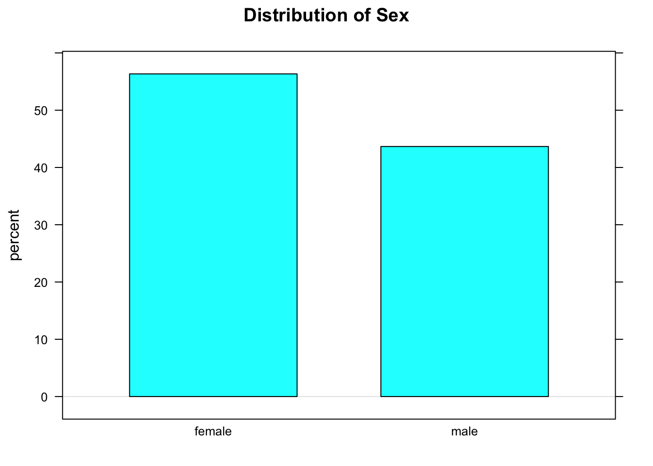
Figure 2.1: Barchart
2.4 Two Factor Variables
Now let’s say that we are interested in the following:
Research Question: Who is more likely to sit in the front: a guy or a gal?
This Research Question is about the relationship between two factor variables, namely sex and seat. We wonder whether knowing a person’s sex might help us predict where the person prefers to sit, so we think of sex as the explanatory variable and seat as the response variable.
Important Idea: When we are studying the relationship between two variables X and Y, and we think that X might help to cause or explain Y, or if we simply wish to use X to help predict Y, then we call X the explanatory variable and Y the response variable.
2.4.1 Two-Way Tables
These are also called cross-tables or contingency tables. You can make them using xtabs():
tabsexseat <- xtabs(~sex+seat,data=m111survey)
tabsexseat
## seat
## sex 1_front 2_middle 3_back
## female 19 16 5
## male 8 16 7In the formula for xtabs() above, the variable you put first goes along the rows of the table. As a rule, we like to put the explanatory variable first.
The counts in the two-way table don’t do much to help us figure out if guys and gals differ with regard to seating preference. That’s because there are more gals than guys in the sample, in the first place, so just because there are more gals in the sample who prefer the front than guys in the sample who prefer the front (19 vs. 8) doesn’t tell you much. What we really want to do is to compare percentages:
rowPerc(tabsexseat)## seat
## sex 1_front 2_middle 3_back Total
## female 47.50 40.00 12.50 100.00
## male 25.81 51.61 22.58 100.00We see that 47.5% of the women prefer the front, whereas only 25.81% of the men prefer the front. Looking at all the row percentages, it appears that as far as the sample is concerned the guys tend to sit more towards the back, as compared to gals.
2.4.2 Barcharts Again
Again, a barchart will convey the information in a table, but in graphical form (see Figure [A Two-Way Barchart]).
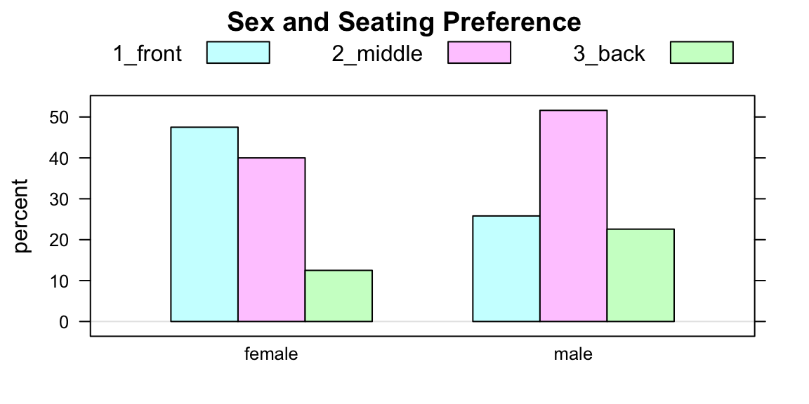
Figure 2.2: A Two-Way Barchart
Some people like to make “flat” barchaerts, using the optional flat parameter:
barchartGC(~sex+seat,
           data=m111survey,
           type="percent",
           main="Sex and Seating Preference",
           flat=TRUE)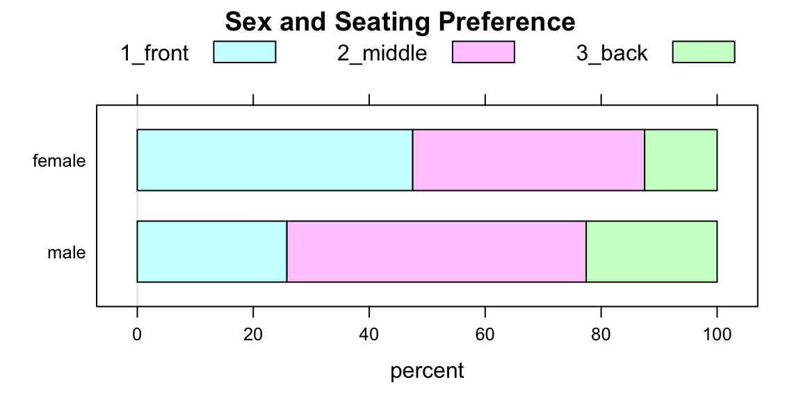
Figure 2.3: A Flat Two-Way Barchart
The lure of flat barcharts (like Figure [Flat Two-Way Barchart]) is that they are a visual “match” for a two-way table of row percentages.
Here is another example:
Research Question: Who is more likely to believe in love at first sight: a guy or a gal?
To address the question numerically, we make a two-way table:
sexlove <- xtabs(~sex+love_first,data=m111survey)
sexlove
## love_first
## sex no yes
## female 22 18
## male 23 8The row percents are:
rowPerc(sexlove)## love_first
## sex no yes Total
## female 55.00 45.00 100.00
## male 74.19 25.81 100.00In the sample, females appear to be more likely to believe in love at first sight (45% vs about 26% for the guys).
Figure [Barchart Sex and Love] shows the same thing graphically.
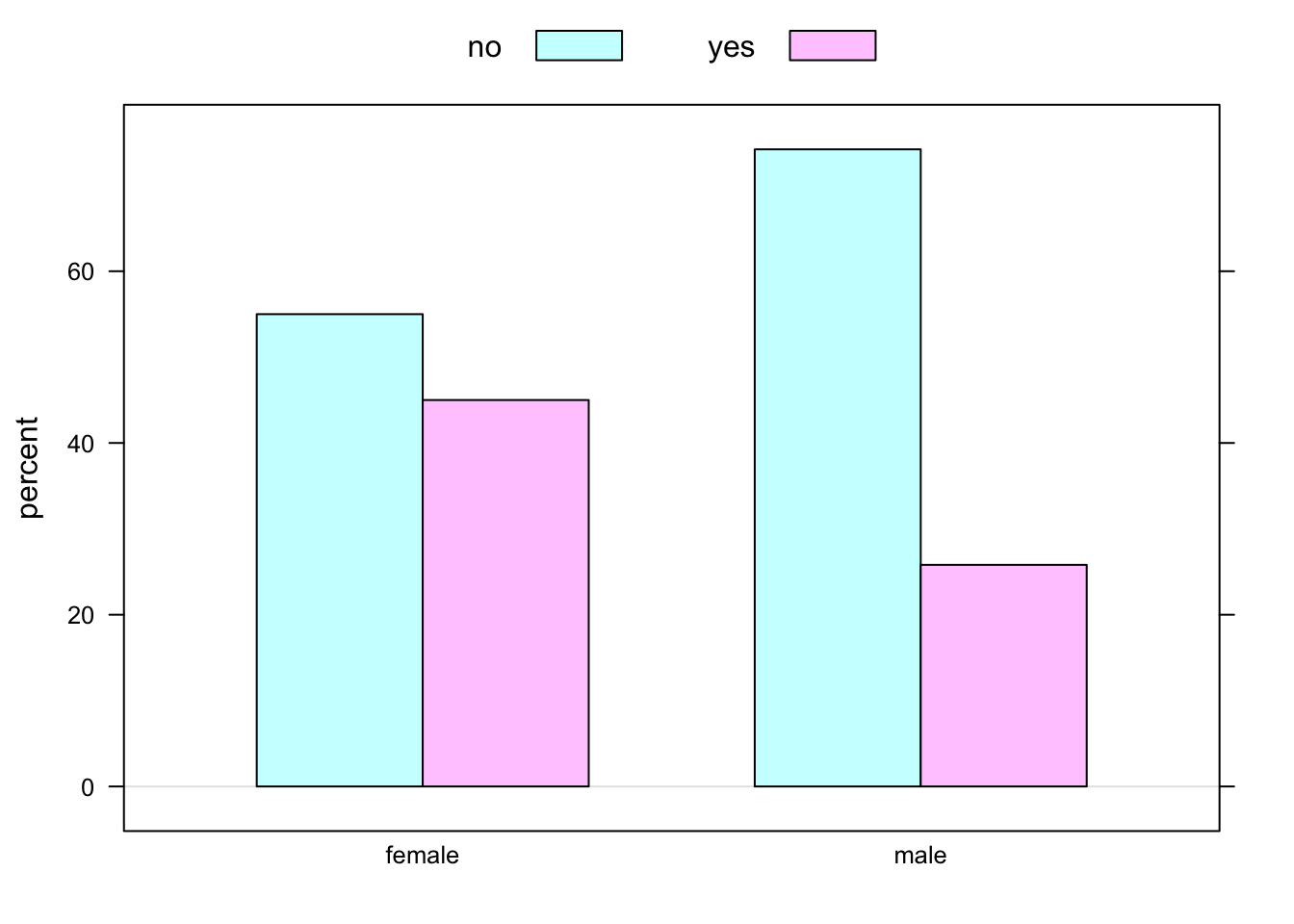
Figure 2.4: Barchart Sex and Love: belief in love at first sight in the m111survey data, broken down by sex of respondent.
2.5 One Numerical Variable
Suppose we are interested in the following:
Research Question: How fast do GC students drive, when they drive their fastest?
This Research Question deals with one numerical variable. As usual, it can be explored both graphically and numerically. There is a lot to say about numerical variables, and many tools have been developed to study them.
Describing the distribution of a single factor variable is pretty straightforward: one simply states the percentages of the time each value of the variable occurs in the data. When we describe a single numerical variable, there is more to say. Specifically, we want to describe:
- The Center
- The Spread
- The Shape
We will learn more about these terms as we go along.
To help with describing center and spread, we will learn about several numerical measurements:
- the median and other percentiles
- the five-Number Summary
- the mean
- the standard deviation
- the Interquartile Range
To help with describing shape, we will consider three graphical tools:
- Histogram
- Density Plot
- Boxplot
2.5.1 Numerical Measures
A convenient way to obtain some important numerical summaries of a dataset is provided by the R-function favstats. For the current Research Question, we would invoke:
favstats(~fastest,data=m111survey)## min Q1 median Q3 max mean sd n missing
## 60 90.5 102 119.5 190 105.9014 20.8773 71 0In this section we will discuss each of the measurements provided by favstats.
2.5.1.1 The Mean
The mean of a list of numbers is the sum of the numbers, divided by how many there are. When the list of numbers is a sample from a population, then the mean is called the sample mean and is written \(\bar{x}\). The mean of a population is called the the population mean and it is often written as \(\mu\).
Sometimes you see the formula for the sample mean written like this:
\[\bar{x}=\frac{\sum{x_i}}{n},\]
where:
- \(\sum\) means summing
- \(x_i\) denotes the individual values to be summed
- \(n\) denotes the number of values in the list.
Most of the time we will get the mean of a variable through favstats, but if we ever want the mean alone we can get it with the R-function mean:
FakeData <- c(2,4,7,9,10)
mean(FakeData)
## [1] 6.4Sometimes it’s just easiest to compute the mean “by hand”, or use R as a calculator to compute the mean:
(2+4+7+9+10)/5## [1] 6.4For many data sets, the mean appears to be about in the “middle” of the data, so it is often used as a measure of the center of the distribution of a variable.
2.5.1.2 The Standard Deviation
The standard deviation (or SD for short, or even just \(s\)) indicates how much a typical data value differs from the mean of the data.
Here is the mathematical formula for the SD of a sample:
\[s = \sqrt{(\sum{(x_i - \bar{x})^2})/(n-1)}.\]
This is a symbolic way of saying:
- Find the mean of the numbers.
- Subtract the mean from each number \(x_i\) (the results are called the deviations), and then square the deviations.
- Add up the squared deviations.
- Average them, almost, by dividing the sum by how many there are MINUS ONE. (What’s up with that?? Consult the GeekNotes to find out!)
- Take the square root of this “almost-average.”
The bigger the SD, the more spread out the data are, and so the SD is often used as a measure of the spread of the distribution of a variable. Most of the time, a majority of the numbers in a dataset lie within one standard of the mean, and nearly all of them lie within two SDs of the mean. We’ll learn more about this later, when we come to the 68-95 Rule.
2.5.1.3 The Median
Suppose that you have some data, sorted in order from lowest to highest:
FakeData <- c(2,4,7,9,10)The median of the data is the number that is right in the middle:
median(FakeData)## [1] 7If there are an even number of data points, then the median is the average of the two points closest to the middle:
FakeData2 <- c(2,4,7,9,10,15)
median(FakeData2)
## [1] 8Note that in FakeData2 the values 7 and 9 were closest to the middle, and the median is the average of these two values:
(7+9)/2## [1] 8About 50% of the data values will lie below the the median of the data. Like the mean, it is often used as a measure of the center of a distribution.
2.5.1.4 Quantiles and the IQR
Since the median lies above about 50% of the data, it is often called the 50th percentile of the data, or the 50th quantile of the data. For every percentage from 0% to 100% there is a corresponding quantile. You can get as many of them as you like by using R’s quantile function. For example, if you want the 20th, 50th, 80th and 90th quantiles of the variable fastest in the mat111survey data, try
with(m111survey,
     quantile(fastest,probs=c(0.2,0.5,0.8,0.9))
     )
## 20% 50% 80% 90%
## 90 102 120 130Here’s you interpret the quantiles provided above:
- About 20% of the students in the survey drove slower than 90 mph.
- About 50% of the students in the survey drove slower than 102 mph. (This is the median.)
- About 80% of the students in the survey drove slower than 120 mph.
- About 90% of the students in the survey drove slower than 130 mph.
Of course you could also say:
- About 80% of the students in the survey drove faster than 90 mp.
- About 50% of the students in the survey drove faster than 102 mph.,
and so on!
Two important quantiles are:
- the 25th quantile (also called the first quartile)
- the 75th quantile (also called the third quartile)
They are provided in favstats as Q1 and Q3 respectively:
favstats(~fastest,data=m111survey)## min Q1 median Q3 max mean sd n missing
## 60 90.5 102 119.5 190 105.9014 20.8773 71 0The difference between them is called the interquartile range, or IQR for short:
\[IQR=Q3-Q1=119.5-90.5=29.\]
The IQR tells you the range of the middle 50% of the data, so it is often used as a measure of spread: the bigger the IQR, the more spread out your data are.
The five-number summary gives you a good quick impression of the distribution of a variable: The five numbers are:
- the minimum value of the data
- the first quartile Q1
- the median
- the third quartile Q3
- the maximum value of the data
Note that all of these measurements are provided in favstats.
2.5.2 Graphical Tools
Numerical measurements aren’t very satisfying on their own. To understand fully what they are telling you, and to be able to say something about the shape of a distribution as well, you need to combine them with graphical tools for describing the variable.
2.5.2.1 The Histogram
The histogram is a popular device for representing the shape of the distribution of a numerical variable. Figure [Two Histograms] shows two common types: a frequency histogram on the left, and a percentage or relative frequency histogram on the right.
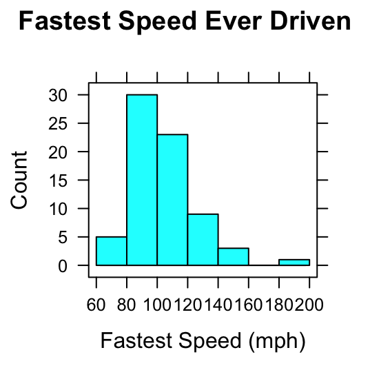
Figure 2.5: Two Histograms. Histograms of the variable fastest in the m111survey data. On the left the vertical axis indicates the count of observations falling in each rectangle; on the right the vertical axis indicates percents.
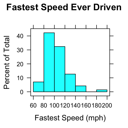
Figure 2.6: Two Histograms. Histograms of the variable fastest in the m111survey data. On the left the vertical axis indicates the count of observations falling in each rectangle; on the right the vertical axis indicates percents.
Here’s the difference:
- In a frequency histogram, the height of a rectangle gives the number of observations falling within the boundaries indicated by the rectangle’s base. For example, in the frequency histogram on the left, the rectangle from 60 to 80 mph on the the \(x\)-axis is 5 units high: this means that five of the students drove between 60 and 80 mph, when driving their fastest. (The speed 60 mph is included in this rectangle, whereas a speed of 80 mph would be included in the next rectangle.)
- In a relative frequency histogram, the height of a rectangle gives the percentage of the observations falling within the boundaries indicated by the rectangle’s base. For example, in the relative frequency histogram on the right, the rectangle from 80 to 100 mph on the the \(x\)-axis is about 42 units high: this means that about 42% of the students drove between 60 and 80 mph, when driving their fastest.
Most of the time, we will deal with a third type of histogram known as a density histogram. An example is given in Figure [Density Histogram].
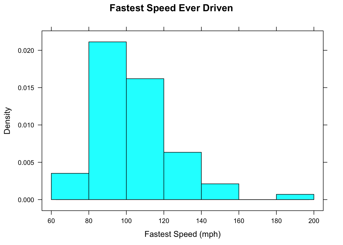
Figure 2.7: Density Histogram. The area of each rectangle gives the proportion of observations that fall within the boundaries indicated at the base of the rectangle.
In a density histogram:
- the area of a rectangle gives you the proportion of data values that lie within the left and right-hand endpoints of the rectangle;
- the total area of all of the rectangles equals 1.
For example, in the rectangle from 100 to 120 mph, the width is 20 and the height is about 0.016, so the area is
\[20 * 0.016=0.32,\]
which says that 0.32 is the proportion of the students who drove between 100 and 120 mph. In more familiar terms, we would say that about 32% of the students drove between 100 and 120 mph.
Density histograms seem to be a round-about way to get percentages: why not just look at relative frequency histograms instead? The answer will become more clear when we study the next graphical device: the density plot.
2.5.2.2 Density Plots
From time to time we will work with an imaginary population contained in the data frame imagpop:
data(imagpop)There are 10,000 people in this population.
Figure [Income Histogram] shows a density histogram of the annual incomes in this population. The histogram consists of approximately 100 rectangles.
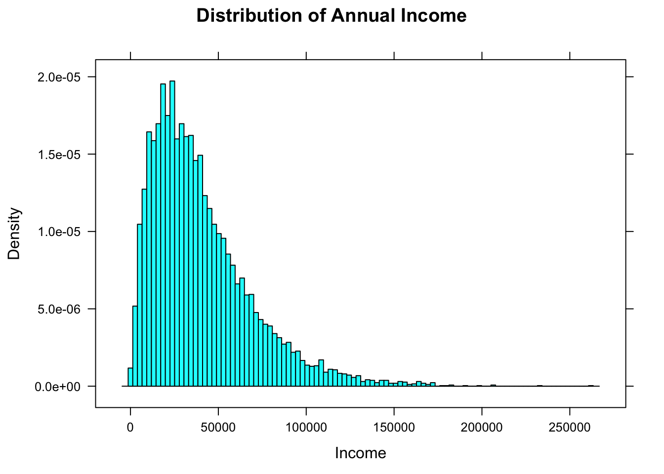
Figure 2.8: Income Histogram. The number of rectangles has been chosen to be very large.
When the number of rectangles is very large, don’t you just see, in your mind, a smooth curve that the tops of the rectangles seem to follow? R can draw that curve for you if you call the function densityplot:
densityplot(~income,data=imagpop,
            main="Distribution of Income\n(Density Plot)",
            xlab="Annual Income (dollars)",
            plot.points=FALSE)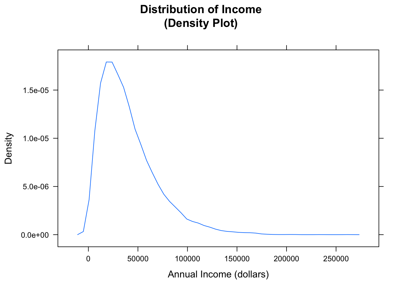
Figure 2.9: Income Density Plot. The plot shows the general shape of the distribution.
The results are shown in Figure [Income Density Plot]. Areas under a density curve give you proportions, so the total are under a density curve is 1.
Density plots aren’t just for whole populations. When you are dealing with sample data from a population the density plot gives you an estimate–based on your sample–of what the distribution of the population might look like. Figure [Fastest Density Plot] shows a density plot of the fastest speed ever driven for the subjects in m111survey sample.
densityplot(~fastest,data=m111survey,
            main="Fastest Speed Ever Driven",
            xlab="speed (mph)",
            plot.points=TRUE)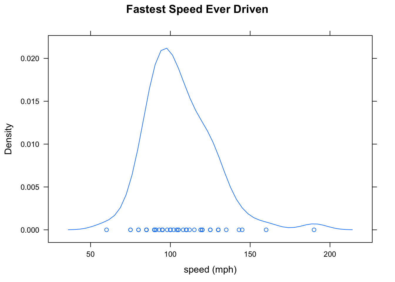
Figure 2.10: Fastest Density Plot. When the number of data points is not too large, it is good to produce a “rug” of individual points by setting plot.points to TRUE.
2.5.2.3 Describing Shape
When it comes to describing a distribution, recall that we want to describe center, spread and shape. So far we have measures for:
- Center (mean, median)
- Spread (standard deviation, interquartile range)
We use our graphical tools to describe shape. Some important features to look for when describing the shape are:
- skewness (left-skewed, right skewed)
- symmetry
- number of modes (unimodal, bimodal)
A symmetric distribution looks like a mirror image of itself around some central vertical line. A skewed distribution has a tail running off to the left (smaller values) or to the right (larger values). The modes of a distribution correspond to “humps” in the density curve: values that occur quite commonly in the data. Look at Figure [Shapes] for standard examples of these concepts.
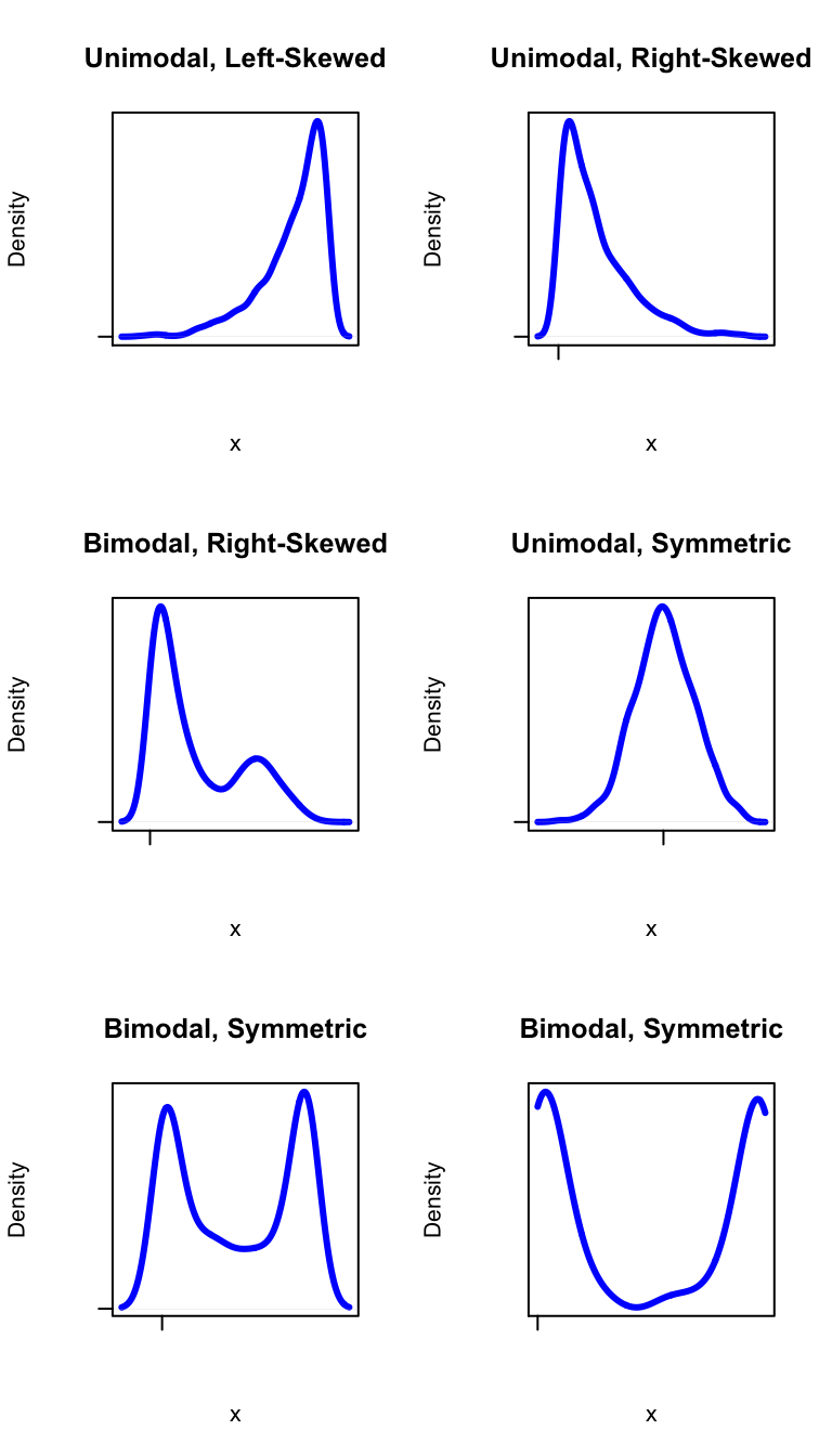
Figure 2.11: Shapes. Terminology for describing the shape of a distribution.
Here are some examples:
- Looking back at Figure [Fastest Density Plot], we see that the distribution of the variable fastest is unimodal, and skewed a bit to the right.
- Figure [Kim Kardashian Temperature] shows a density histogram of ratings given by people in
imagpopto the celebrity Kim Kardashian. The ratings are on a scale of 0 to 100, where 0 indicates that one doesn’t like her, and 100 indicates a very high level of liking. The ratings distribution is symmetric, but bimodal: there are “humps” near 0 and near 100.
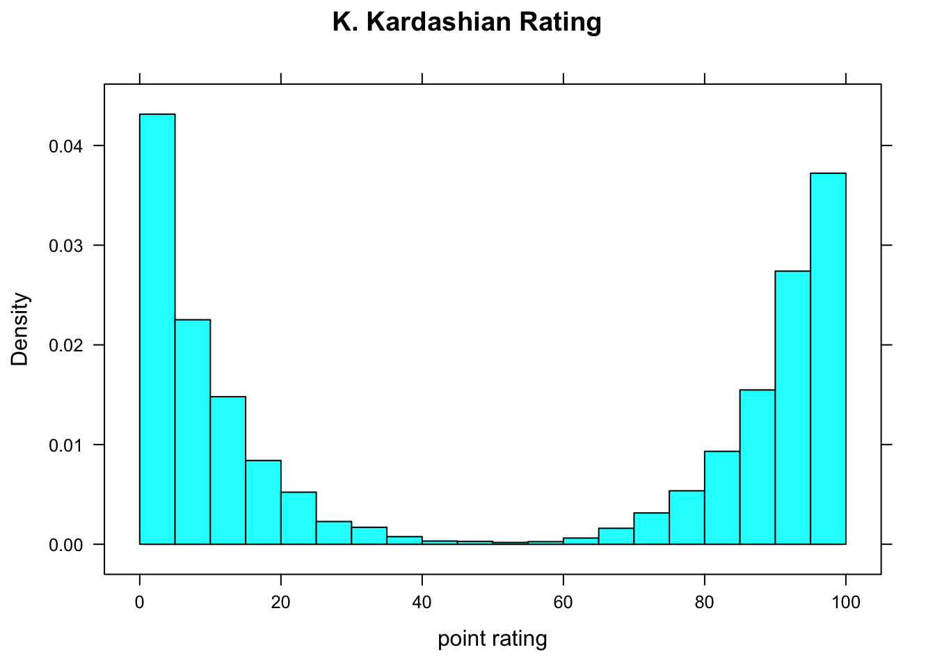
Figure 2.12: Kim Kardashian Temperature. People either love her or hate her!
2.5.2.4 Box-and-Whisker Plots
The five-number summary is the basis for a very useful graphical tool known as the box-and-whisker plot, or just “boxplot” for short. Figure [Boxplot] shows a boxplot of some imaginary data:
ImaginaryData <- c(7.1,7.3,7.5,8.2,8.5,9.1,9.5,
                   9.8,9,9,9.9,10,10.5,10,9)
bwplot(~ImaginaryData,xlab="x",main="Example Boxplot")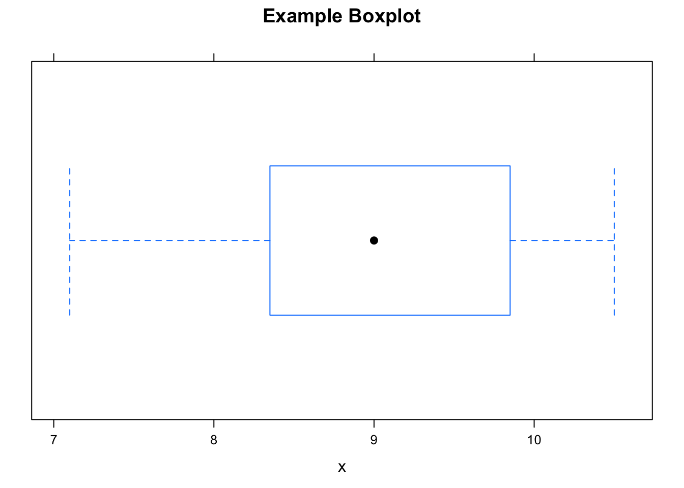
Figure 2.13: Boxplot. Box-and-whisker plot of some imaginary data.
Here are the basic features of a boxplot:
- The dot is at the median of the data.
- The box starts at Q1 and goes to Q3. Therefore the length of the box is the IQR of the data. The middle 50% of the data lie within the box.
- The lower hinge is at the minimum of the data. From the lower hinge to Q1, we see the lower “whisker”, indicated by a dotted horizontal line. The lowest 25% of the data is in this whisker.
- The upper hinge is at the maximum of the data. The upper whisker extends from Q3 to the upper hinge, and contains the largest 25% of the data.
Figure [Boxplot Height] shows a boxplot of the heights of the students in m111survey. It was produced as follows:
bwplot(~height,data=m111survey,
       main="Height at GC",
       xlab="height (inches)")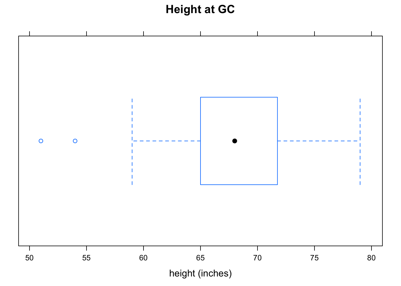
Figure 2.14: Boxplot Height. Note the two outliers.
Note that this time the lower hinge does not extend all of the way down to the minimum value: there are two heights so small that R decided that you might consider them to be outliers. An outlier in a dataset is a value that lies far above or far below most of the other values. When R detects possible outliers, they are plotted as individual points.
When R plots outliers on a boxplot, it extends the whisker to the most extreme value that it did NOT consider to be an outlier. Thus in the heights data, there was at least one person who was 59 inches tall (lower hinge at 59), but this value was not deemed an outlier.
Boxplots are not only useful for detecting possible outliers: they can also detect skewness easily. Look at Figure [Boxplot Fastest], which shows the fastest speeds driven by the m111survey participants. As we have seen previously, this distribution is a bit skewed to the right, and the boxplot shows the skewness: the upper whisker is somewhat longer than the lower whisker, indicating that there is longer “tail” toward the higher values of speed. We also see that there is an outlier at 190 miles per hour.
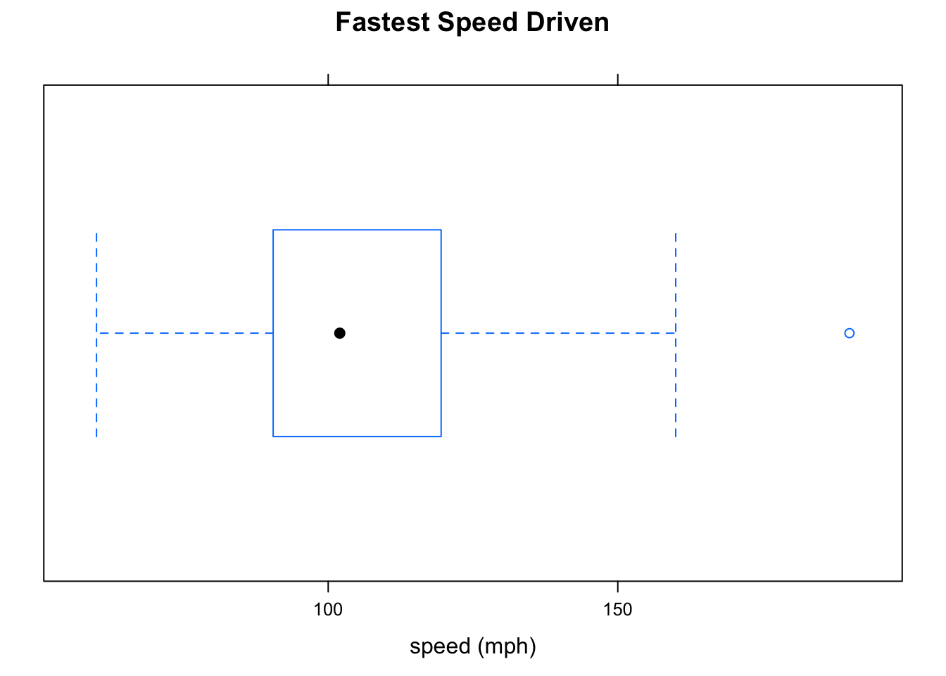
Figure 2.15: Boxplot Fastest. The distribution is a little bit skewed to the right, and there is an oulier at about 190 mph.
Although boxplots excel at detecting skewness and outliers, they fail miserably at detecting modes, so if you are interested in modes you should look at a density plot or histogram as well. Figure [Kardashian Violin] shows a combination of a violin plot and a boxplot for the Kim Kardashian ratings in the imagpop population. A violin plot is nothing more than a density plot combined with a mirror image of itself. Places where the violin is “thick” are regions where data values are relatively crowded together; in “thin” regions, data values are more widely separated from one another. Note that the boxplot correctly indicates that the distribution is symmetric, but entirely misses the bimodality.
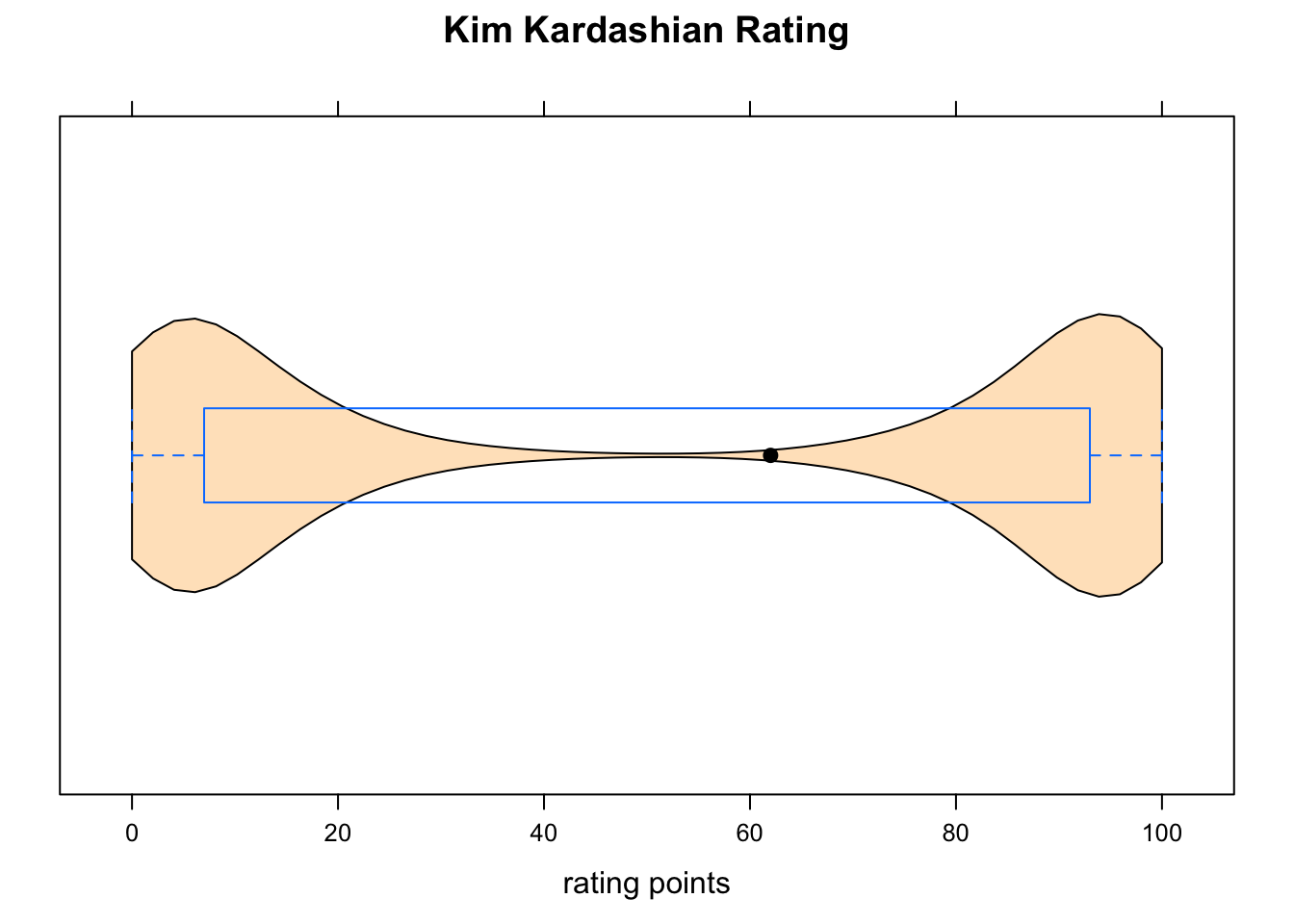
Figure 2.16: Kardashian Violin. The violin plot supplements the boxplot, indicating that the data are clumped around 0 and around 100, and are quite sparse in the middle.
2.6 Factor and Numerical Variable
Suppose that we are interested in the following:
Research Question: Who tends to drive faster: GC guys or GC gals?
This research question concerns the relationship between two variables in the m111survey data: fastest and sex. fastest is numerical, and sex is a factor. Since we are inclined to think that one’s sex might, through cultural conditioning, have some effect on how fast one likes to drive, we shall consider sex to be the explanatory variable and take fastest to be the response variable.
Let’s investigate this question both numerically and graphically.
2.6.1 Numerical Tools
We use the same numerical measurements as when we are studying one numerical variable, but we have to compute them separately for each of the groups that go along with the different possible values of the factor variable. In the current Research Question, the factor variable sex has two values (“female” and “male”), so we need to separate the two sexes and compute numerical statistics for each of the two groups thus formed.
The R-function favstats can do this easily. For formula-data input, we use m111survey as the data, just as usual, but the formula must look like
\[numerical \sim factor\]
Thus we compute:
favstats(fastest~sex,data=m111survey)## sex min Q1 median Q3 max mean sd n missing
## 1 female 60 90 95 110.0 145 100.0500 17.60966 40 0
## 2 male 85 99 110 122.5 190 113.4516 22.56818 31 0The next step is to decide what numbers to compare. The minima and the maxima differ a lot for the two groups, but each of these numbers might be based on only one individual. It’s better, therefore, to compare measures of center. The mean for the males is 113.5 mph, considerably higher than the female mean of 100 mph. Therefore it seems that the males tend to drive faster, on average than the females in the sample drive. (One could also compare medians and arrive at the same conclusion.)
2.6.2 Graphical Tools
Again, we can use histograms, density plot and boxplots, but whichever tool we choose we must “break down” the numerical data into groups determined by the values of the factor variable.
2.6.2.1 Parallel Boxplots
For boxplots, use the same \(numerical \sim factor\) formula as for favstats. Figure [Boxplot of Fastest by Sex] shows that guys tend to drive faster: the median for the guys is somewhat higher than the median for the gals. We might also point out that “box” for the guys, which represents the middle 50% of the guys’ speeds, is higher than the middle 50% of the gals’ speeds.
bwplot(fastest~sex,data=m111survey,
       main="Fastest Speed Driven, by Sex",
       xlab="Sex",
       ylab="speed (mph)")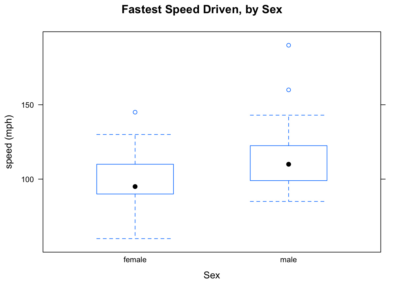
Figure 2.17: Boxplot of Fastest by Sex.
Here is another example:
Research Question: Who tends to have higher GPAs? People who prefer sitting in the front, the middle or the back?
We will investigate the question graphically and numerically. For a numerical approach, we use favstats. The variable GPA is numerical, and seat is a factor, This tells us how to call the favstats function:
favstats(GPA~seat,data=m111survey)## seat min Q1 median Q3 max mean sd n missing
## 1 1_front 2.1 3.05 3.500 3.7 4.0 3.337667 0.4822950 27 0
## 2 2_middle 1.9 2.90 3.200 3.5 3.9 3.110645 0.5344276 31 1
## 3 3_back 2.2 2.80 3.057 3.5 3.7 3.092333 0.4473687 12 0Front-sitters seem to have a little bit higher GPA, on average, than other folks do (3.34 for front-sitters, vs. about 3.1 for the other two groups). It’s not clear whether this is a really big or important difference, though.
For a graphical approach, let’s look at Figure [GPA by Seat]. We see that the front-sitters have a higher median than the other two groups do.
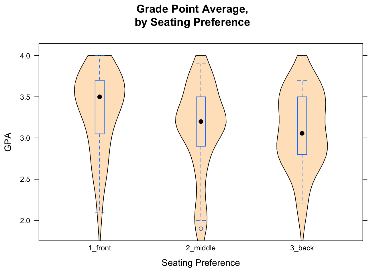
Figure 2.18: GPA by Seat.
2.6.2.2 Side-by-Side Histograms
In order to make a histogram for each group determined by the values of a factor variable, you need to “condition” the numerical variable the factor variable in your formula. This is accomplished using the vertical line “|” on your keyboard (look above the backslash character). In the Research Question about the relationship between fastest and sex, we would invoke:
histogram(~fastest|sex,data=m111survey,
       type="density",
       main="Fastest Speed Driven, by Sex",
       xlab="Fastest Speed, in mph")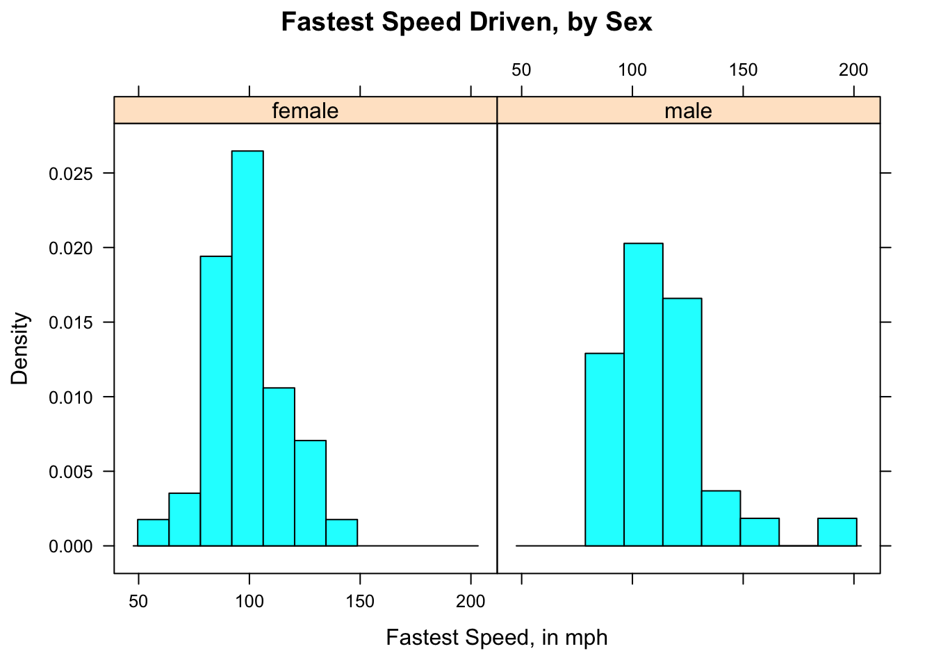
Figure 2.19: Speed by Sex. Histogram for female and male speeds appear in separate panels.
The results appear in Figure [Speed by Sex], which shows that the guys tend to drive faster: the male histogram is shifted somewhat toward higher speeds, as compared to the female histogram.
2.6.2.3 Verical Layout
It’s not always easy to compare histograms side-by-side. You may prefer to use the arrange the histograms vertically using the layout option:
histogram(~fastest|sex,data=m111survey,
       type="density",
       main="Fastest Speed Driven, by Sex",
       xlab="Fastest Speed, in mph",
       layout=c(1,2))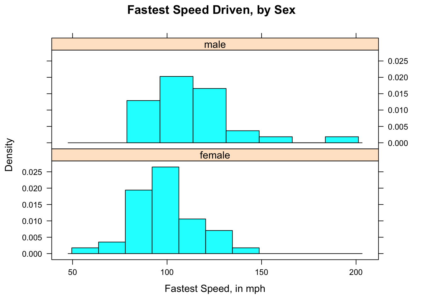
Figure 2.20: Speed by Sex (2). Histogram for female and male speeds appear in separate panels, laid out in one column.
In the graph [Speed by Sex (2)], the variable sex has two values, so you want the vertical layout to have two rows. The option layout=c(1,2) in the code for the graph specifies one column and two rows.
2.6.2.4 Grouped Density Plots
Overlaying two density plots – one for the guys and one for the gals – can make the difference between the two distributions quite clear. Overlaying can be accomplished using the groups argument:
densityplot(~fastest,data=m111survey,
       groups=sex,
       main="Fastest Speed Driven, by Sex",
       xlab="speed (mph)",
       auto.key=TRUE)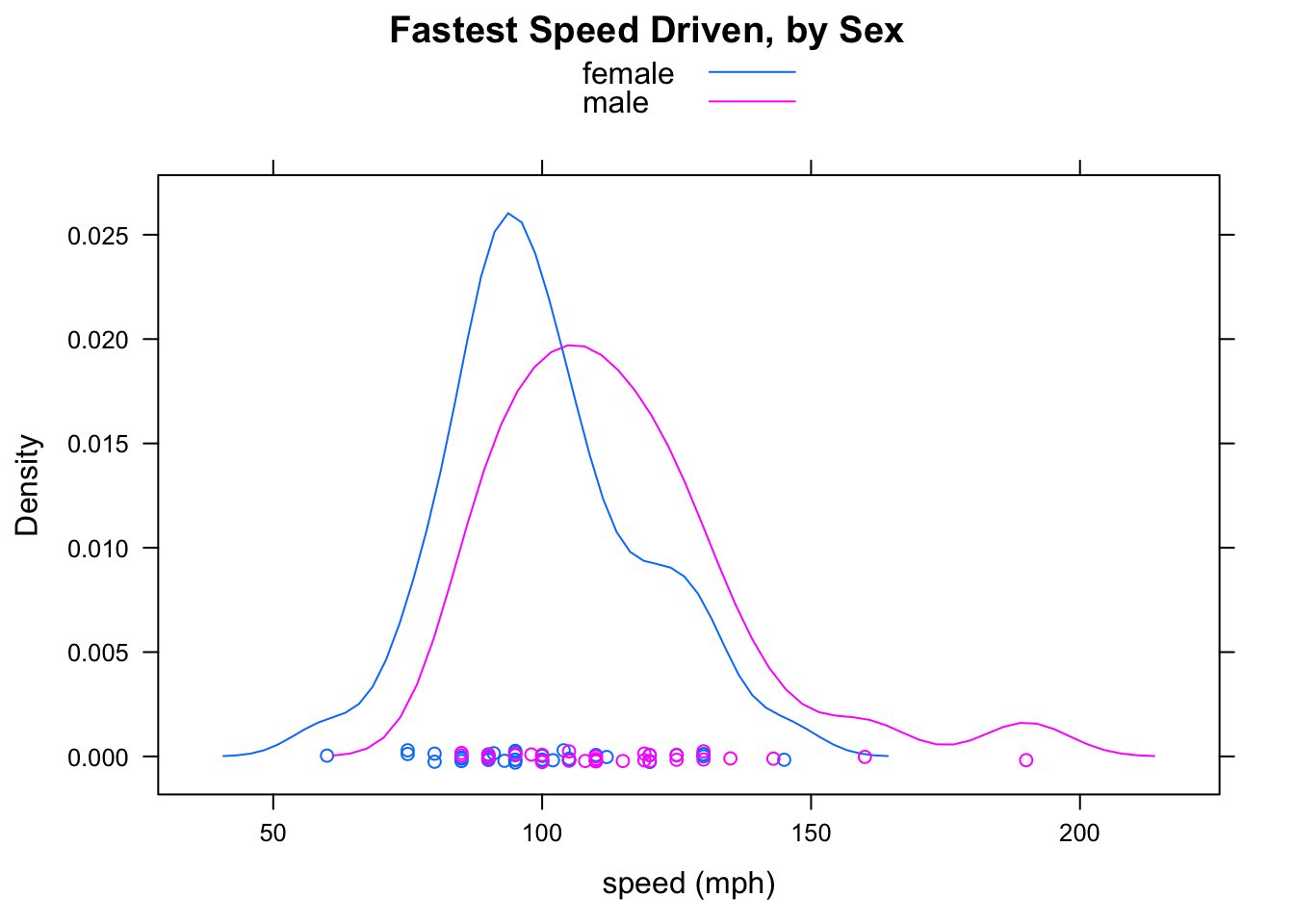
Figure 2.21: Grouped Density Plots. It is very easy to see that the mode for the males is greater than the mode for the females.
Figure Grouped Density Plots shows the results. Indeed, the guys drive faster: their density plot is shifted a bit to the right, in comparison to that of the gals.
If you would rather see the plots in different panles, you can do so in the same way you did with histrograms. Again, you might want to include the layout argument. Figure [fastestsexdensity2] shows the results
densityplot(~fastest|sex,data=m111survey,
       main="Fastest Speed Driven, by Sex",
       xlab="speed (mph)",
       auto.key=TRUE,
       layout=c(1,2))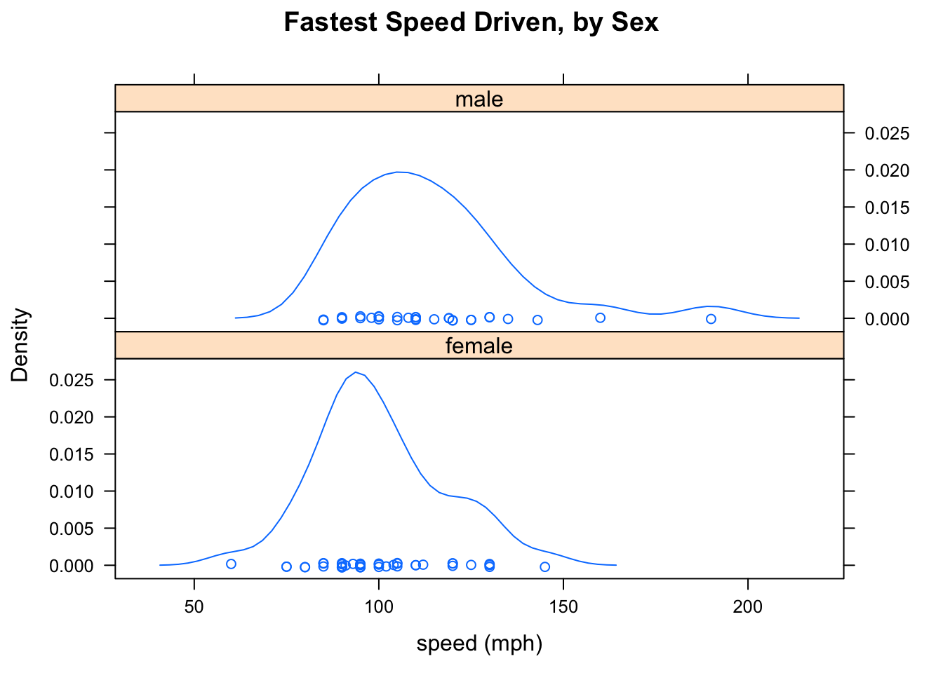
Figure 2.22: Density Plots arranged vertically. Again it is easy to see that the mode for the males is greater than the mode for the females.
2.7 Choice of Measures
2.7.1 Mean, Median and Skewness
If you are looking at a histogram or density plot of some numerical data, then:
- about half of the area of the plot will lie below the median (this is because about 50% of the data values are less than the median);
- the mean of the data will be approximately the place where you would put your finger, if you wanted the histogram or density plot to “balance”" if you held it up supported only by your finger.
Accordingly, when the distribution is symmetric the mean and the median will be about the same. But what happens if the distribution is skewed? In order to make the plot balance, the mean will have to be closer to the tail of the data than the median is. Figure [Symmetry and Skewness] illustrates what happens.
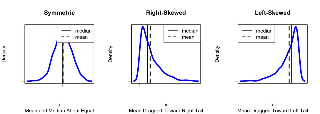
Figure 2.23: Symmetry and Skewness. The mean and the median are about the same when the distribution is symmetric. For right-skewed distributions the mean is bigger than the median, and for left-skewed distributions the reverse is true.
You can investigate these ideas with following app, too:
require(manipulate)
Skewer()
2.7.2 Mean, Median and Outliers
Not only is the mean “dragged” toward the tail of a skewed distribution – it is also dragged toward outliers. the median, on the other hand, is not much affected by outliers at all. For example, consider the small dataset:
SmallDataset## [1] 32 45 47 47 49 56 56 56 57SmallDataset has just nine values. A call to favstats gives:
favstats(~SmallDataset)## min Q1 median Q3 max mean sd n missing
## 32 47 49 56 57 49.44444 8.079466 9 0The mean is about 49.4, and the median is the fifth value in the dataset: the 49. Now let’s add just one extreme value to the data, say the number 200:
NewData <- c(SmallDataset,200)
NewData
## [1] 32 45 47 47 49 56 56 56 57 200Then call up favstats again:
favstats(~NewData)## min Q1 median Q3 max mean sd n missing
## 32 47 52.5 56 200 64.5 48.21537 10 0The median is now the average of the fifth and sixth data values: \((49+56)/2=52.5\), so it has gone up just a bit. But the mean has increased markedly, from 49.4 to 64.5. In fact, the mean is now considerably larger than every data value except for the outlier at 200 – it no longer serves well to indicate what a “typical” data value might be.
Note also that the SD is affected by the outlier, increasing from about 8 (SmallDataset) to about 48 (NewData). No longer does it serve well as a measure of how “spread out” most of the data is. The IQR, on the other hand, is scarcely affected by the outlier.
2.7.3 Mean/SD vs. Median/IQR
We have two sets of measures for the center and the spread of a distribution:
- the mean (center) and the SD (spread);
- the median (center) and the IQR (spread).
In many circumstances either one of these pairs serves well to describe center and spread. However:
- when a distribution is STRONGLY skewed, or
- when it has SEVERE outliers in one direction but not the other,
the preferred measures of center and spread are the median and the IQR, rather than the mean and the SD. The graphs and calculations from the previous section back up this criterion.
2.8 Bell-Shaped Distributions
2.8.1 The 68-95 Rule
People like to use the mean as a measure of center and the SD as a measure of spread, because of the following rule of thumb:
The 68-95 Rule (also known as the Empirical Rule): If the distribution of sample data or of a population resembles a unimodal symmetric (“bell-shaped”)" curve, then
- About 68% of the values lie within one SD of the mean.
- About 95% of the values lies within two SDs of the mean.
- About 99.7% of the values lie within three SDs of the mean.
The rule works surprisingly well, even when the data are somewhat skewed. The following manipulate app illustrates something of the scope and the limitations of the 68-95 Rule:
require(manipulate)
EmpRule()
Here is an example of the use of the 68-95 Rule:
A certain population consists of people whose heights have a roughly-bell-shaped distribution, with a mean of 70 inches and a standard deviation of 3 inches.
- About what percentage of the people in the population are between 67 and 73 inches tall?
- About what percentage are more than 73 inches tall?
- About what percentage are less than 64 inches tall?
For the first question, we note than 67 and 73 are respectively one SD below and one SD above the mean of 70. Hence by the “68” part of the 68-95 Rule, about 68% of the population should be between 67 and 73 inches tall.
For the second question, note that 64 is two SDs below the mean of 70. By the “95” part of the 68-95 Rule, we know that about 95% of the population is between 64 and 76 inches tall (76 is two SD above the mean of 70). The remaining 5% lies outside of this range, and since bell-shaped distribution is symmetric, about half of this amount should lie below 64 and about half should lie above 76. Half of 5% is 2.5%, so about 2.5% of the poulation is less than 64 inches tall.
It is good to have graphs in mind when you think about the 68-95 Rule. The app EmpRuleGC provides a graphical way to use the 68-95 Rule. In order to solve the problems in the previous example, just try:
require(manipulate)
EmpRuleGC(mean=70,sd=3,xlab="height (inches)")
2.8.2 \(z\)-scores
When we use the 68-95 Rule, we think about how many SDs a number is away from the mean of the data. In general, even when we aren’t thinking about the 68-95 Rule, we can measure how “unusual” a data value is by figuring out how many SDs it is above or below the mean of all of the data. If \(x\) is some value, then we compute:
\[z = \frac{x-\bar{x}}{s},\]
where:
- \(x\) is the actual value
- \(\bar{x}\) is the mean of the data
- \(s\) is the standard deviation of the data.
\(z\) is called the z-score for \(x\).
For example, suppose that Linda is 72 inches tall. How does she compare with the other GC students in the m111survey data? Is she unusually tall, unusually short, or rather typical? We can use her \(z\)-score to judge.
To find Linda’s \(z\)-score, we need the mean and the SD of the heights in the m111survey data, so we call:
favstats(~height,data=m111survey)## min Q1 median Q3 max mean sd n missing
## 51 65 68 71.75 79 67.98662 5.296414 71 0The mean is about 67.987 inches, and the SD is about 5.296 inches. Hence Linda’s \(z\)-score is:
(72-67.987)/5.296## [1] 0.7577417The \(z\) score is about 0.76, which means that Linda is only about three-fourths of a standard deviation above the mean height. She is not that unusual. If she were a full standard deviation above the mean, then the 68-95 Rule would tell us that about 16% of the students in the m111survey data are taller than her (think about why this is so), but since she is not quite as tall as that we know that probably MORE than 16% of the students are taller than her. So Linda is taller than average, but not unusually tall.
Of course, we might wonder whether Linda is unusually tall, for a female. To find her \(z\)-score relative to females, we need the mean and the SD for females in m111survey, so we call:
favstats(height~sex,data=m111survey)## sex min Q1 median Q3 max mean sd n missing
## 1 female 51 63 65 68 78 64.93750 4.621837 40 0
## 2 male 65 70 72 74 79 71.92097 3.048545 31 0We find that the mean for the female sis about 64.938 inches, and the SD is about 4.622 inches. Linda’s \(z\)-score relative to the females is:
(72-64.838)/4.622## [1] 1.549546So Linda is about 1.55 SDs above the mean female height. That’s more impressive, but still not terribly unusual.
Let’s adopt the following convention:
A value shall be considered unusual if its z-score is less than -2 or more than 2.
This convention is most useful when the distribution is roughly bell-shaped, but it makes sense for other distributions, too, as long as they are not too strongly skewed, and don’t have extreme outliers.
Here is another example, in which we use \(z\)-scores to compare individuals.
Example. George comes from a school where the mean GPA is 3.4, with a SD of 0.3. Linda comes from a school where the mean GPA is 2.8, with a SD of 0.4. George’s GPA is 3.6, and Linda’s GPA is 3.3. Although the schools have different grading patterns, the students at both schools are believed to be equally strong, on the whole.
- Compute George’s z-score.
- Compute Linda’s z-score.
- Based on the z-scores, who do you think is the stronger student?
- Harold is from the same school as George. His z-score is -0.5. Is Harold above or below average? What is Harold’s actual GPA?
For Question 1, we simply compute George’s \(z\)-score as follows, using the mean and SD for Harold’s school:
(3.6-3.4)/0.3## [1] 0.6666667For Question 2, we compute Linda’s \(z\)-score, using the mean and SD for her school:
(3.3-2.8)/0.4## [1] 1.25For Question 3, we check to see who has the higher \(z\)-score. Linda is 1.25 SDs above the mean for her school, whereas George is only 0.67 SDs above the mean for his school. Since both schools are thought to be equally strong in terms of the academic profile of their students, we conclude that Linda is the more outstanding student.
For Question 4, we note that Harold’s \(z\)-score is -0.5, putting him half of a standard deviation below average for his school. Since the mean is 3.4 and the SD is 0.3, Harold’s actual GPA must be:
3.4-0.5*0.3## [1] 3.25So Harold’s GPA is 3.25.
Here is one last example:
Example. Belinda comes from a school where the mean GPA is 3.2, with a SD of 0.25. At this school you win a small scholarship if oyur GPA is higher than all but 97.5% of the other students. Approximately what is the minimum GPA that will secure Belinda a scholarship?
To answer this question, we recall that about 95% of the students will have GPAs within 2 SDs of the mean. Two SDs is \(2 \times 0.25= 0.5\), so 95% are between \(3.2-0.5=2.7\) and \(3.2+0.5=3.7\). Half of the remaining 5% (that’s 2.5%) will be bigger than 3.7, so the rest (97.5%) will be BELOW 3.7. This is our answer: Belinda needs to secure a GPA of at least 3.7 in order to get the scholarship.
2.9 Reading in Statistics
Reading is a primary skill that is developed during your first year at Georgetown College (think about your FDN 111 class). IN FDN 111, you learn that the Read Skill has four components:
- Reading in context
- Reading for structure
- Reading to interpret
- Reading in a spirit of critical engagement
In this course, we not only read the course text, we also read data and we read tables and graphs. Even in this “quantitative” type of reading, all of the four components of the Read Skill come into play:
- We read data for structure: we note rows (individuals) and columns (variables). We look at the structure of the data, because the type of a variable determines how we explore and describe it.
- We read data to interpret it. Once we know the type of a variable, we know what descriptive techniques might help us to summarize and describe it.
- We read tables and graphs for structure and to interpret them. Tables and graphs have their own structures. Tables have rows, columns, cells, and sometimes marginal totals. Graphs have axes, scales on the axes, axis labels, titles, legends, etc. The parts work together to guide us to a good summary of the data.
- We read data in context. For example, it is important to recall the Help file on mat111: the Help file said that the survey was a survey of MAT 111 students at Georgetown College, and it told us what the variable names meant, what units they were measured in, etc. In more involved situations, such as data analysis in science, reading in context also means learning about the scientific problem that motivated the collection of the data.
- We read in a spirit of critical engagement. For example, when we learn that the students in the
m111surveydata are all from MAT 111, we might wonder whether this sample is very much like a random sample. If not, it might be trustworthy as a guide to how the GC population looks. Also, even when the sample is random we always wonder: “Are the patterns we see in the data also present in the population, or are they just due to chance?” As we proceed in the course, we’ll learn how to answer this sort of question.
As we go along in the course, we will find that the Argue and Write skills are also very much in play when we practice statistics.
2.10 Thoughts on R
2.10.1 New R Functions
Know how to use these functions:
xtabsrowPercbarchartGChistogram,densityplot,bwplotquantilefavstats
2.10.2 Those Pesky Formulas!
The formula-data input format can be confusing at first. However, there are some patterns that will make life easier for you:
The symbol “~” appears somewhere in every formula. This is what alerts R to the presence of a formula.
When you deal with just one variable \(x\), the format is:
goal(~x,data = MyData)When you deal with the relationship between a numerical value \(y\) and a factor variable \(x\), the format is:
goal(y~x,data = MyData)In the formula above \(y\) is usually the response variable and \(x\) is the explanatory, but R doesn’t know anything about that. R just puts the values of the first variable along the y axis, and the values of the second variable along the x-axis.
When you deal with the relationship between two factor variables, the format is:
goal(~x+y, data = MyData)If there is an explanatory variable, we will try to remember to put it first, and the response variable second. (But R neither knows nor cares about explanatory vs. response.)
If your variables come from a data frame, don’t forget to supply the name of the data frame, using the data argument!